I get excited about phones, especially ones that try to go beyond the sea of sameness. The world of Android phones is complicated. You can get very expensive foldable devices and then you even buy something that costs less than 10K. The mid-segment is the sweet spot every manufacturer is aiming for but, at the same time, it’s the zone that’s becoming very boring. I can line up 10 phones and you will have a tough time spotting the best-looking member.
When I say I care about phones I mean the bezels need to be of the same thickness all around, it needs to have good cameras, an excellent software experience…. Most mid-segment phones offer one or the other while charging you roughly the same.

There is enough depth and good shutter speed
Cohesive design
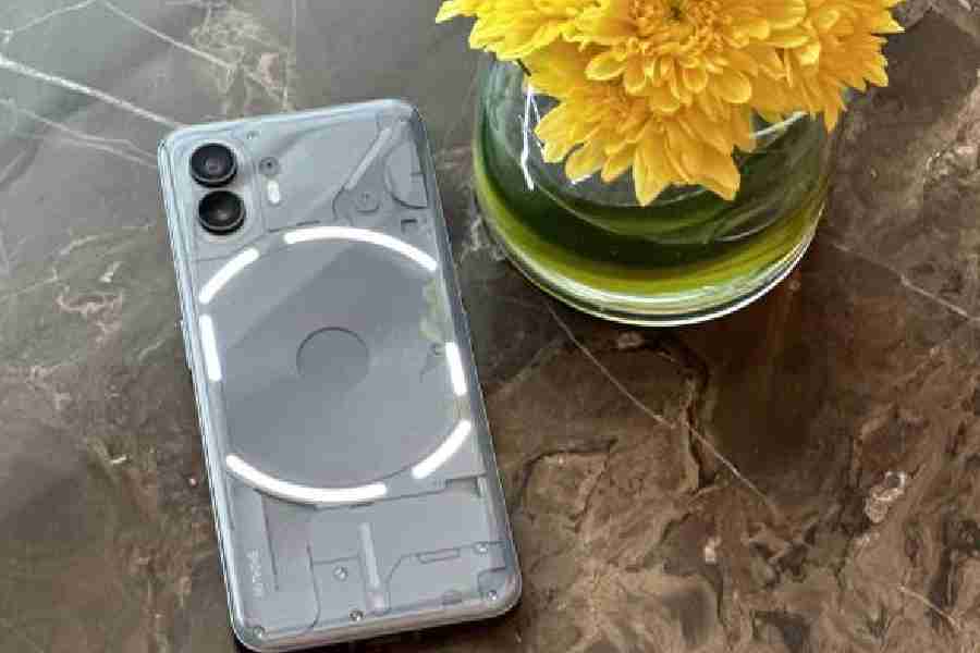
Phone (2) from London-based Nothing goes beyond the obvious by being a design-first smartphone. This year’s darker colour option is a deep grey, which I think works better to highlight the textured panels beneath the back plate. The edges too are more rounded than Phone (1), giving you a better grip. Most importantly, the look of the device blends with the look of the skin Nothing has applied over Android 13. It’s the most coherent design you can get on Android, taking things to the iPhone level. It’s a phone that has the retro feel because of the fonts and design that have been used but, at the same time, it’s futuristic because of how the interface has been designed. I love the option to add widgets to the always-on display which has the same style as everything else.
Team Nothing went beyond the obvious design elements and into how the phone sounds. The camera shutter has a satisfying sound and so the do the ringtones and alert sounds. There is even a beatbox-style app that you can use to come up with ringtones. At first I thought it was all a gimmick but after using the phone over two weeks, it’s one of the most fun elements about the phone.

Colours come across as natural and there is acceptable HDR range
Celebrating disconnect
Any talk about design would be incomplete without mentioning the glyph interface on the back… you know, the white LEDs that glow brightly. There have been several updates over Phone (1) but the idea remains the same, important one — stop doomscrolling.
Each time the phone screen is unlocked for replying to a message, we land up on social media networks and waste time doing nothing. Last year, Apple showed the world the many possibilities of Live Activities. On the always-on display you can track Uber, Zomato and so many things without having to unlock the phone. It can also be seen with the usage of the Dynamic Island on the iPhone 14 Pro. Nothing too has been trying something similar yet very different with its glyph interface.
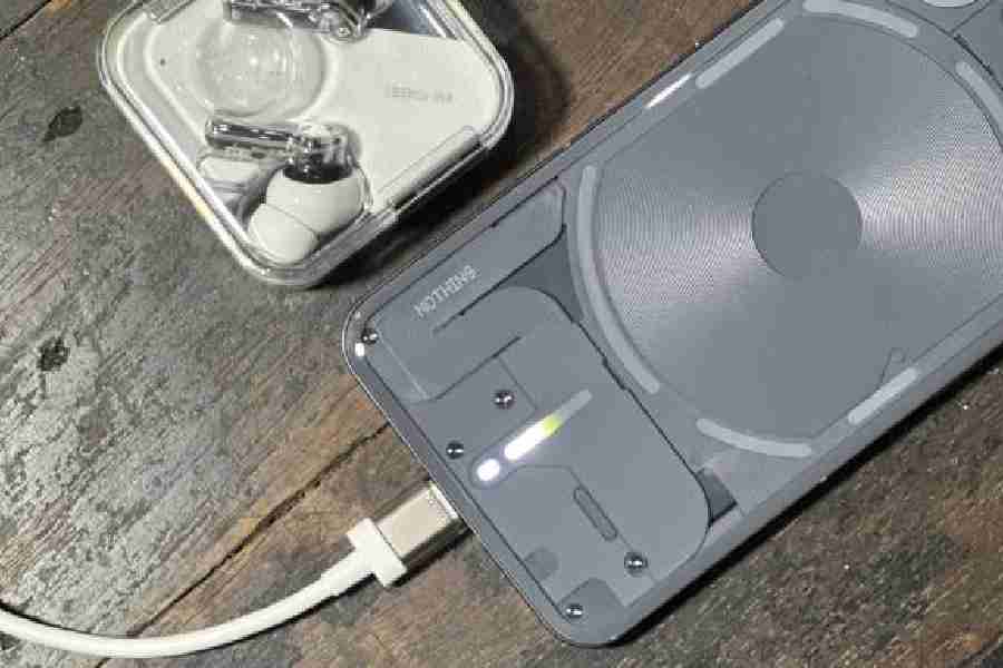
There are a bunch of LEDs and strips. You can use the lights in several combinations to understand what’s happening. For example, you can set the glyphs only to alert about WhatsApp and text messages. Or you can make a glyph glow when a message comes from a particular person. I don’t have to worry about do not disturb because when the screen is put face down, it’ll automatically silence the speaker in favour of the flashing glyphs. Further, you can use the glyph as a timer or progress bar. The more you use glyphs, the more features pop up to delight.
It’s a brilliant start by Nothing and now the question is whether they can get enough third-party developers on board. It’s not enough to just have Zomato and Uber. It will be a big challenge because developers need to have enough incentive to develop for an Android phone manufacturer.

While charging, one of the glyph strips glows
Excellent camera but….
So, how’s the camera? Honestly, it’s very good and it’s very much like on many other Android phones. I know how far the Sony IMX890 sensor on the main camera and Samsung JN1 sensor on the 50MP ultra-wide camera can be pushed. These are good sensors that take very good photographs under sunshine. Even under dim lighting, you will get presentable pictures and it’s great that there is no useless macro camera.
For 90 per cent people this is a fantastic set of snappers. The camera tackles moving subjects very well, boosting the shutter speed, ensuring you get sharp shots. It’s helpful to have if you are filming children, pets or, say, people playing cricket or football.
When I am taking 4K videos @60fps, I can zoom 2x and there is very good stablisation. When shooting videos on the front 32MP camera, it’s 1080p@60fps max. Look, these may appear to be minor issues but, like I said, I care about phones and cameras. I want to see some kind of parity… it will help users while taking videos.
On a bright note, the glyph interface can be of immense help when taking pictures in the dark. Also, the lone splash of colour on the back is in the form of a red dot, which glows when you are taking videos. It’s a good addition.
Enough processing power
Carl Pei and his team made a sensible choice in the processor department. Snapdragon 8+ Gen 1 is a fantastic chip to have even though it’s from last year. I am sure the chipset will hold you in good stead for years. It gave Nothing an opportunity to optimize the chip better than rival phones. Also, the games and apps that we use, for 99 per cent people, this will be enough.
Going hand-in-hand with the chip is the 4,700mAh battery. I just couldn’t make it run dry before bedtime. It easily offers seven hours of screen-on time and you just can’t fault the processor-to-battery performance. Also, there is 45W PPS wired charging and 15W Qi wireless charging, besides 5W reverse charging (helps if you want to juice up Nothing Ear (2) buds).
Should you buy it?
Some may say the phone has the feel of an iPhone. Now, that’s a seriously good thing to have. The 6.7-inch LTPO AMOLED display matches that of many flagship phones. How can that be a bad thing? The operating system with Nothing OS 2.0 does a far better job than what we have seen on any OnePlus phone. It’s smooth, fast and highly customizable.
Agreed that Nothing is still a startup trying to make great devices but ultimately, it’s a startup from Carl Pei, who cares about phones and user experience. Going by Nothing Phone (1), I was happy with the updates that were being pushed out and Phone (2) is expected to follow the same trajectory.
At a time when premium mid-range phones don’t have a personality, Nothing Phone (2) comes with enough of it. It’s clearly a phone with a simple message: You are an individual who needs to standout in the crowd.
Mathures Paul
At a glance
Device: Nothing Phone (2)
Price: Upwards of Rs 44,999 (8GB+128GB, 12+256GB, 12+512GB)
High notes
Great design aesthetics
Always-on display is useful
Excellent battery life
No-nonsense UI
Muffled note
Video recording options can be improved
