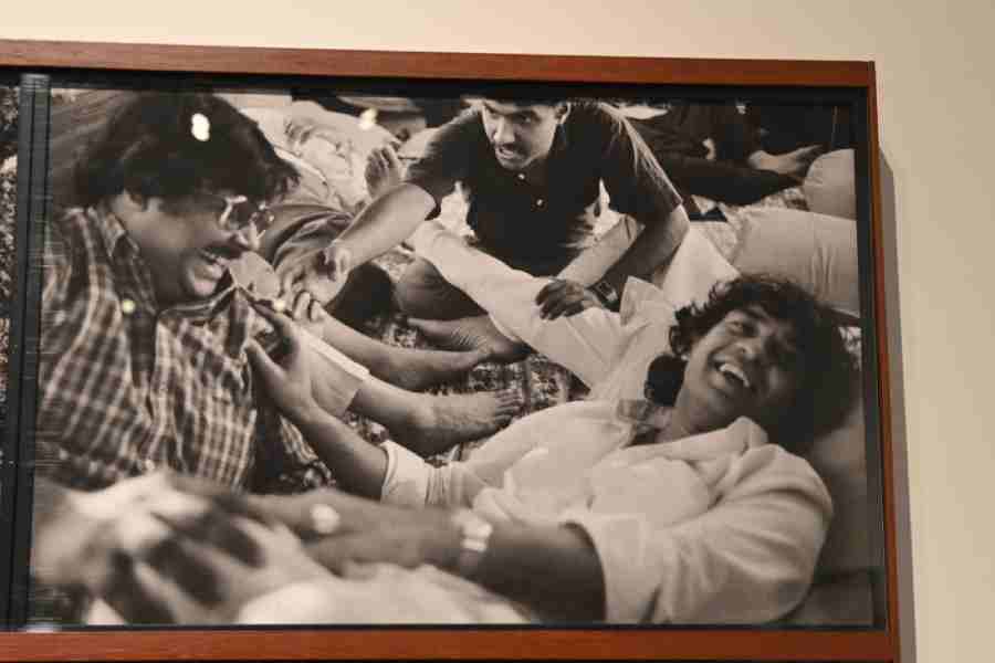
Among films I watched recently, the one that stands out for its use of colour is the animated movie Sing. Released in 2016, it is a remarkable movie that features animals with human abilities in a world inhabited only by animals of various species. The film is about a music fest brought to life by a koala called Moon (voiced by Matthew McConaughey) struggling to keep his father’s theatre afloat. Famous Hollywood stars and singing sensations have lent their voices and sung for this. There are the dulcet voices of Tory Kelly, Taron Egerton, Scarlett Johansson, Reese Witherspoon and even Bono. It is a feast for both the eyes as well as ears. All the anthropomorphic animals are clad in bright colours. So are the buildings, lights, cars and motors. It is a world of technicolour brilliance, like a dream. Add to this the human drama of survival. It is a multicoloured, radiant movie. Sing 2 is also expected to be a multi-hued extravaganza. (Which film stands out for you for their creative use of colours... November 11)
Pampa Paul
I believe the film adaptation of Jane Austen’s classic novel Pride & Prejudice (2005) and the Academy Award-winning film The Sound of Music (1965) stand out for me for their creative use of colours.
Set against the backdrop of 19th-century England, Pride & Prejudice vividly explores the lives of the Bennet sisters as they embark on a journey to find suitable matches for themselves. It also focuses on the whirlwind romance between the witty Elizabeth and pompous Mr Darcy. Besides the impressive characters and memorable dialogues, it also incorporates a marvellous colour palette, setting the tone of the bygone era. The opulence of earthy tones in the film not only resonates with the myriad personalities of the characters but also radiates a charming aesthetic appeal.
The Sound of Music, on the other hand, revolves around the journey of a young, jovial nun Maria (Julie Andrews), determined to add a dash of exuberance to the lives of the seven neglected children of a retired naval captain. The utilisation of earthy tones brings out warmth, comfort and steadiness which was subtly ingrained in the efforts put in by Maria to encourage the children to enjoy every moment to its fullest.
Be it the background or the costumes, this element was evident in both films, acting like the proverbial cherry on the cake. No matter how many times one may watch them, the mesmerising visuals will always enchant the viewers, compelling them to rewatch these heartwarming and poignant films over and over again!
Aayman Anwar Ali
The Matrix series films fuse colour to define two worlds: the world of the Matrix and the real world. When Neo is inside the Matrix, a simulation of reality, there is a green tint similar to technological programming and data shown on earlier computer screens. When he is in the real world, the film has a blue tint — a cool atmosphere outside the false warmth of the Matrix. It is the blue of a world destroyed.
Edward Scissorhands (1990) introduced viewers to a lonely stranger and submerged him into a world bustling with life, colourful personalities and what is considered ‘normal’. The film uses the contrast between the dark that surrounds Edward and his home and the pastel vibrancy of the world he is introduced into. The end of the film blends the two worlds by adding colour to Edward’s home.
Her (2013) uses the colour red for romance, compassion, hope and passion. The film’s protagonist, Theodore, is often surrounded in some way by the colour: his clothing, the walls, windows, furniture and flowers. It is due to this that he is visually distinct, set apart and lonely.
Moonlight (2016). This dramatic indie film casts a dreamlike glow over every scene while challenging the extremes of contrast, shadows and glints of light. The lush, verdant surroundings intentionally clash with the dark challenges of the characters’ lives. The film uses rich and lustrous tones, neons and heavy saturation to enhance the storyline while having a dazzling impact on viewers.
The Pianist (2002) places great emphasis on colour scheme, flawlessly transitioning from richer, brighter tones of elegance and comfort to the gradual draining and greying of colour. As the world around Szpilman and his mental and physical state deteriorates and darkens, so does the colour gradient. At some points, the rich colours return, but they are not as vibrant as before... they are often muted as they merge with bleak reality. The lavish tones make an appearance at the end of the film, as Szpilman plays the piano for a large audience.
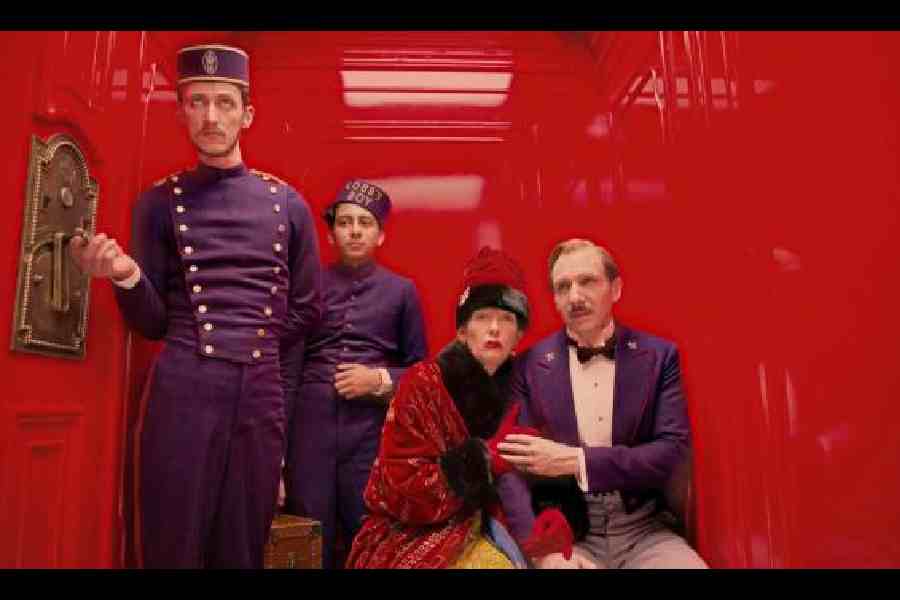
The Grand Budapest Hotel (2014) imbued colour into its entire storyline. Every relationship, time period, emotion and location was highlighted by an endless selection of colours. There is the nuance of saturation: colouration ranging from the communist period’s olive green and orange to the 1930s wedding cake, rich and full-bodied tones, as well as the distinctive colours of the other hotels.
Vertigo (1958) contains a vibrant red/green motif indicating danger and vibrancy. The intense colour scheme and the stark backgrounds create a dreamlike experience.
The colours are deep but always held in check in In the Mood for Love (2000). They are perfectly embodied by the woman’s beautiful, colourful but always modest and appropriate dresses. This and the director’s choices of shots and editing demonstrate that it’s never going to quite happen for these two but the depth of feeling is truly there.
Three Colours: Blue (1993) In the case of this film, ‘liberty’ is freedom from the memories and oppressiveness of the past. As with the other films in the series, the director constantly has the key colours present themselves in crucial objects and at vital points in the film. In this film, the colour blue links the woman to a past which she now finds almost unendurably painful but also to a life of freedom, once she works through the burden of that past.
Ramyani Sanyal
Satyajit Ray’s films Sonar Kella and Hirak Rajar Deshe stand out not only for their lavish riot of colours but also because of their appropriate usage according to the mood, context and setting of the sequences.
Sonar Kella is simply a delight for the eyes due to the variety of colours embedded in it. If the Jaisalmer fort, the desert sand and Rajasthani potteries emit golden yellow at its brightest... Ray has liberally sprinkled red and other bright colours in the turbans and ethnic wears of the rural indigenous people rendering local folk songs near Ramdeora station.
Similarly, the whole canvas of Hirak Rajar Deshe is rich in all sorts of colours — right from the dresses of Goopy-Bagha to the interiors of the palace of the wicked King including the Jantar Mantar Ghar or brainwashing chamber.
Kajal Chatterjee
My favourite movie with an interesting colour palette is Cruella, which uses bold colours to mirror the transformation of its characters. It incorporates a lot of black and white, symbolising Cruella’s iconic look. Along with black and white, silver, gold and red comprised the main colour palette, representing the stark contrast between a cunning Estella and the vile and vivacious Cruella de Vil. Bright shades of red and gold accentuate their shared rebelliousness, passion and grit. The use of vibrant colours and geometric patterns brings out the creative and daring personality of Emma Stone’s characters as they simultaneously evolve in the course of the movie. The film’s visual palette amplifies the story’s themes of identity, ambition and self-expression. On the other hand, Baroness von Hellman, played by Emma Thompson, carries old Hollywood glamour with her wardrobe abounding in warm browns and golds.
Throughout the film, the diverse range of vibrant colours reflects the characters’ emotions, the 1970s London fashion and the movie’s overall edgy and stylish tone.
Camellia Paul
The film from our time which stands out to me most for its use of colour is the Wes Anderson-directed film The Grand Budapest Hotel. Masterful usage of colour in this 2014 film by the gifted filmmaker — who is very well-known to movie-buffs for the utilisation of colours uniquely and fantastically in his films — made the movie visually stunning and a mesmerising watch for the viewers. According to me, this film is not only just one of the most colourful Hollywood movies but also one of those movies that made the best usage of colours, to date.
Sourish Misra