By day, Jon Worth works as a communications consultant for European politicians. In his spare time, he makes Brexit flowcharts — 27 versions since January, to be exact.
Brexit has become a tangled, confusing web of decisions and possible outcomes that change almost daily. It is both the perfect candidate for diagraming what happens next and a Sisyphean task of trying to outline every possibility.
“In the beginning people were like, ‘What the hell is he doing?’ and then people were like, ‘Wait, it’s actually a really useful way to understand Brexit,’ ” Worth said. “And now people ask me, ‘Where’s the next version of the diagram?’ ”
But he’s exhausted. After more than two dozen updates to his flowchart, he’ll take a break on April 12, the deadline for Britain to leave if Parliament does not approve Prime Minister Theresa May's deal — regardless of what is happening with Brexit. He says he can’t keep going at this pace.
Worth has become a bit of a cult hero among the Brexit flowchart community (if the dozen or so of us that have attempted to make visual sense of Brexit count as a community). He’s admired more for his commitment to keeping up with every Brexit turn than any graphic design sensibility.
Still, he said he has photographic evidence that officials in the British government like his diagrams so much they are printing them out and hanging them up on their walls.
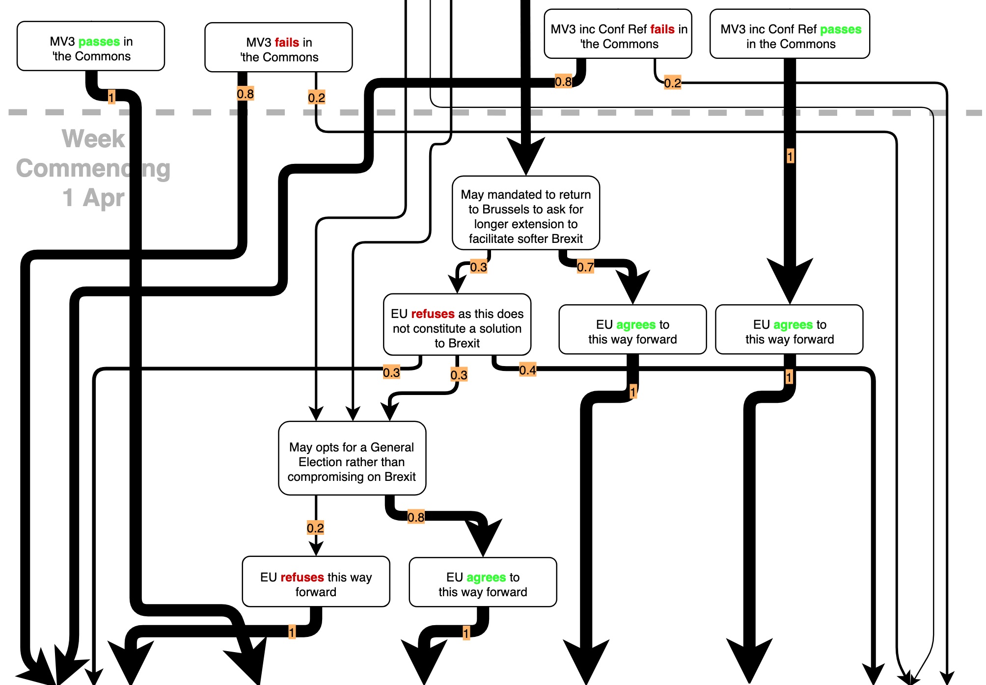
One of many flowcharts explaining Brexit permutations created by Jon Worth, a communications consultant for European politicians. The New York Times
Worth’s flowcharts also try to do the impossible: assign a likelihood that each Brexit scenario will occur. In one, he thinks the most likely single outcome is a no-deal Brexit on April 12.
No one can be sure what will happen next, and the chart is more an educated guess than actual statistical analysis. But he argues that Brexit is not completely unpredictable.
“Each actor in the Brexit process has a hierarchy of preferences and has behaved in certain ways until now, so to some extent you can predict what they’ll do next,” Worth said.
Last week he gave the speaker of the House of Commons, John Bercow, just a 10 per cent chance of blocking May from a third vote on her deal. And then Bercow did just that. On Thursday, Bercow agreed to allow a vote after it was scaled back to just one part of May’s deal, the withdrawal agreement.
“The British government itself hadn’t even thought he would do that, so at least I had it as an option,” he said, laughing.
There are some outcomes he believes are impossible to assess. For example, the likelihood that May would resign or be forced out. On Monday, his latest version of the chart addressed the what-if scenario with a cute cloudlike annotation.
By Wednesday, the cloud was outdated. May offered to resign if her plan were approved. Worth has mostly worked on the left in British politics and says he is “weaker at understanding the internal dynamics of Conservative politics.”
It is still unclear whether May will eventually resign, though it seems inevitable.
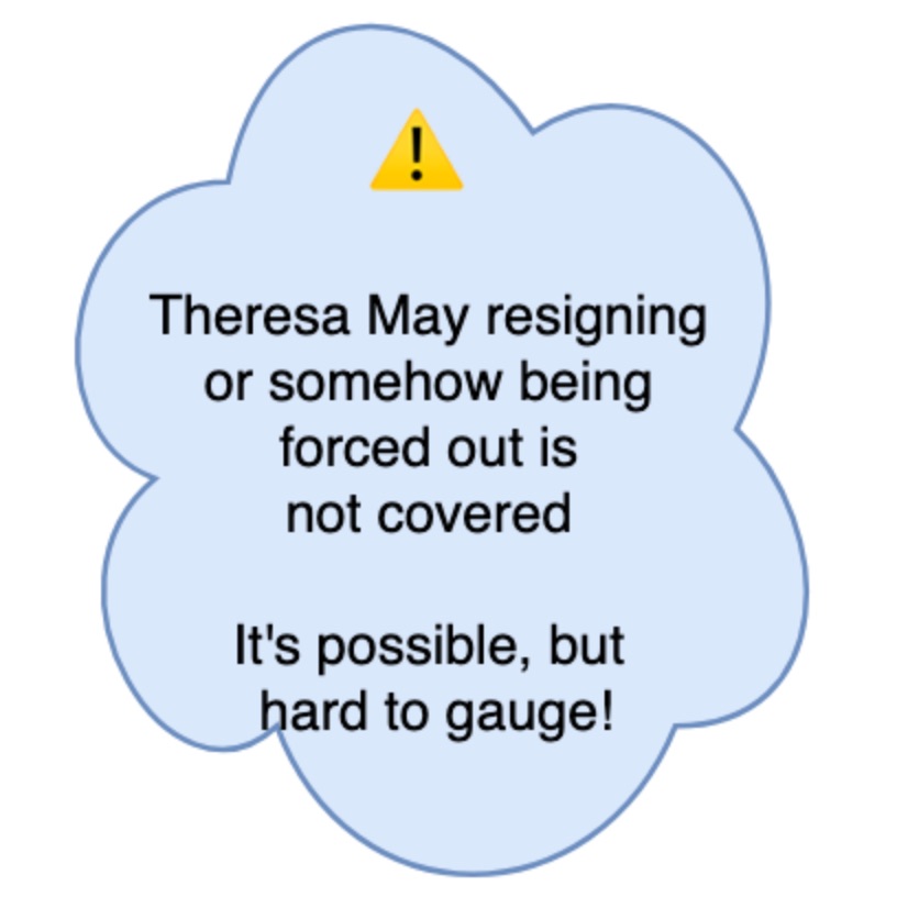
A detail from one of Jon Worth's flowcharts. The New York Times
Not everyone is a fan of the flowcharts. Worth said people regularly complain that his diagrams don’t contain certain options, and others just outright dislike them. British satirical magazine Private Eye tweeted its own chart, to which Worth said his friends responded, “Jon, they’ve seen your diagrams!”
For those considering entering into the Brexit flowchart game, Worth has some salient advice: have a clear objective before you start drawing, and think about what you’re trying to achieve.
“My aim is to see Brexit decisions as predictable and see these decisions flow from one to another,” he said.
It is a reasonable, fleeting goal. Now, on to version 28.
“To be honest I kind of hoped we might have had a solution by now,” Worth said. “But if there’s one thing that’s predictable about Brexit, it’s that when you think you’re going to reach a solution, you never do.”
c.2019 New York Times News Service

