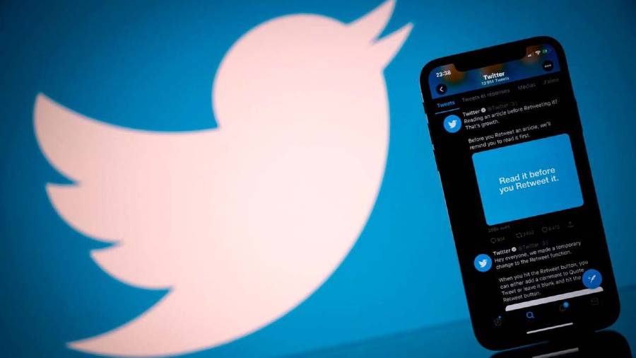
Firing up the Twitter app may present you with an extra option that you may not have asked for — a “downvote” arrow to the right of the “like button”. The experimental feature, which Twitter started testing last year, is now being visible to a global audience.
“We’ve been testing how we can surface the most relevant replies within Tweets with the use of downvoting on replies…. A majority of our users shared that the reason they clicked the down arrow was either because the reply was perceived as offensive, or because they perceived it as not relevant, or both,” the official Twitter Safety account has tweeted.
Like Reddit and YouTube before it, this is Twitter’s “dislike” button for replies or comments in response to original tweets. The feature, announced July last year, has started rolling out globally and like any other update, the reception is mixed. Some perceive the button as a way to curb harassment and misinformation while others worry that it’s a way to offload content moderation to users.
The company has said that it had “learned a lot” about the downvoting option in its initial limited testing. “We learned a lot about the types of replies you don’t find relevant and we’re expanding this test –– more of you on web and soon iOS and Android will have the option to use reply downvoting.”
The dislike button is only visible to the person who is viewing tweets – it is not a publicly available metric or visible to the author of the tweet.
In the past, YouTube has found dislikes problematic, making vote-count private as of November last year. Facebook had experimented with downvotes, but never implemented them. It preferred to initially only give users the option to “like” content and then expanded the range of reactions using emoji.
But where is the feature everyone has been asking for – an edit button?


