It’s been a great year for Samsung’s smartphone division, which has delivered some of the best devices of the year, be it Galaxy S21 Ultra 5G, Galaxy Z Fold3 5G or Galaxy Z Flip3 5G, besides several mid-range offerings. The South Korean company has made the deal sweeter by announcing the official launch of One UI 4, which is a software overlay for Samsung phones and is based on Android 12. It’s this overlay or skin that we interact with and it makes your Samsung phone different from that of other brands. Though there are a number of big features on One UI 4, let’s look at some of the ones that will make life easier.
Visual enrichment
When Android 12 launched, one of the big features is Material You, which changes the overall colour scheme running through the OS based on your chosen wallpaper. Samsung has its version of the overhaul, which looks stunning and gets applied easily. There is a strong colour palette and once a combination is chosen, everything — from the home screen to icons, menus to buttons on Samsung stock apps — gets reimagined. This is like having your personal stamp on the smartphone experience.
In fact, everything on One UI 4 looks colourful and well-designed. Take dark mode for example. Instead of just a change to the background, the icons also get dimmed ever so slightly. Not that it is something extremely noticeable but as you keep using dark mode, it will be far easier on the eyes than before. Or take the charging-screen animation, which is no longer boring. Even widgets have received an overhaul with more rounded corners and options. In the files section, the thumbnails are larger. Once again, it may not seem like a major change but it certainly adds to the overall feel of the device which you may end up using six to eight hours a day.
On the camera front
Everything is labeled clearly. For example, the level of zoom is now clearly indicated and when you turn on pro mode and then enable grid lines, you have a level indicator. Next, when you scan a QR code, you can either go to the URL or copy that URL, which is useful. The shutter button in the video mode is a lot faster than before. The moment you tap the shutter, video starts recording, which previously happened after you removed the finger from the button; every second makes a difference.
In the photo editor, you can now add emojis to your video or photo, which is pretty cool. Also interesting is that you can select video and photographs and turn them into a collage. You can change the ratio of the creative, which will ultimately help improve the social media game.
This and that
Here we look at a number of options across the device. When you press down on an app, there are more options than simply locating it or finding more details about it. Now you can add to home screen or uninstall an app. That saves a lot of pain.
The other important update is ‘media output’ while playing music from the locked screen. By clicking on ‘media output’ you can easily change the output to different devices, like your headphones or Bluetooth speaker. Plus you get extra music control options depending on the music app you are using.
Equally impressive are more options in the always-on section. Under ‘show a clock and notifications when your phone isn’t in use’ there are four options — ‘tap to show for 10 seconds’, ‘show always’, ‘show as scheduled’ and ‘show for new notifications’. And the notifications are slightly condensed, so you can see more of them at once.
When video is set to picture-on-picture mode, you can resize the same by pinching in or out… it’s easier than dragging out from the sides.
The device care section has also got a major overhaul. Now there is an emoji to show the health of your device; you are easily made aware if you have any battery or security issues.
The dual clock widget now not only lets you keep track of time in two cities but each tile can have a different colour, depending on time of day. The Samsung Calendar has a new widget that lets you see the monthly calendar and ‘today’s events’.
Coming to the keyboard, it’s simpler. Sticker, GIF and emoji have been combined into one icon while the emoji section has a feature where you can make your own GIF by combining two existing emojis. But the best change is Samsung’s tie up with Grammarly to offer suggestions for corrections.
Privacy department
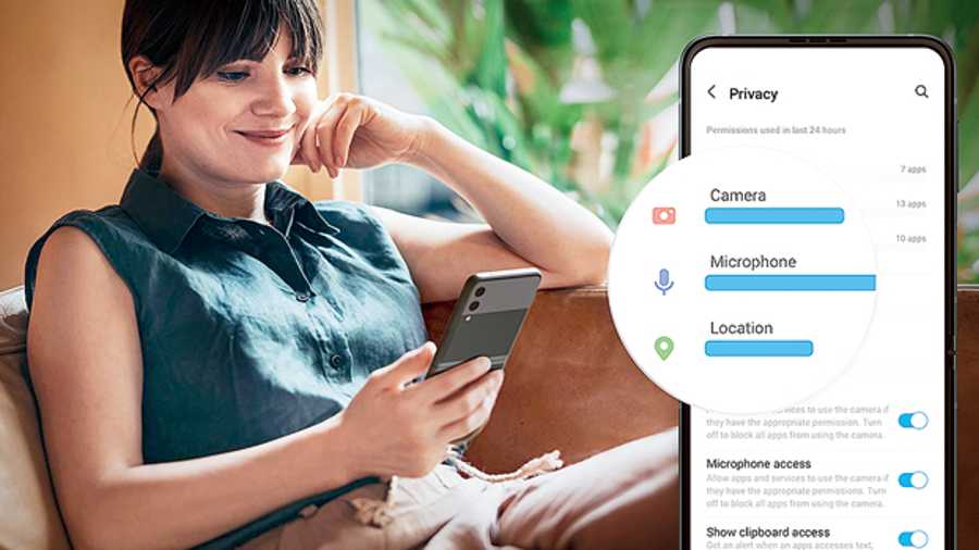
It’s easy to look at the access options you have allowed different apps and at what time. There is also inclusion of camera, microphone and location permissions. In case you don’t want an app to access certain permissions, it’s easier to turn it off.
Second, whenever an app is accessing your microphone or camera, you are notified by a green dot that will appear on the top right-hand corner of the screen. And you can instantly block all apps from using the camera or microphone using the new tiles in the quick settings menu.
When an app requests your location, there is an option to give access to approximate location. For example, a weather app shouldn’t need one’s precise location.


