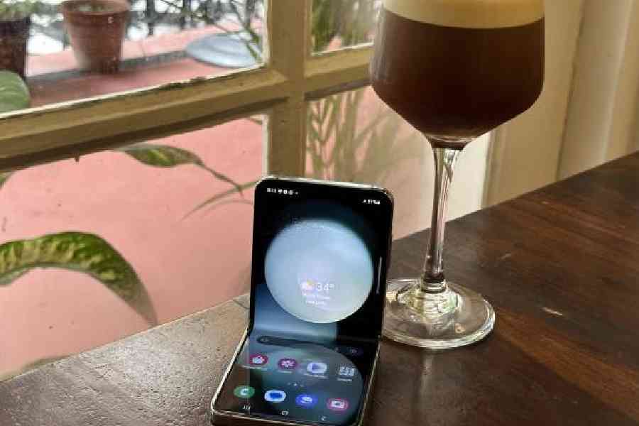
Bryan Adams had his ‘summer of 69’ while Samsung is having its time in the sun with the most innovative phone of the year — Galaxy Z Flip5 5G. The world has already seen four versions of the phone but the fifth iteration deserves a chef’s kiss.
The new Flip phone is still adorable but what it now has is a bigger cover screen, a new hinge and a new SoC. But the most exciting part: You won’t have to always flip it open for simple tasks, and the screen durability and battery life have also picked up steam.
Attracting your colleague’s envy is the way the phone now closes fully without leaving a gap between the two halves, also the big outer screen. Frankly, the gap between the two halves wasn’t that big last year but it did allow room to gather dust. This time, there is no gap when the phone is closed and it’s thinner.
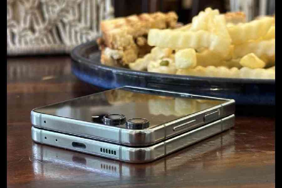
When the Galaxy Z Flip5 is shut, there is no gap between the folds
After a few weeks of use, the slight crease on the screen doesn’t show signs of wear. The crease itself isn’t really noticeable while looking straight at the phone and from an angle, it’s only slightly visible but that’s because of reflections from different light sources.
Opening and closing the phone feels extremely satisfying. It has an IPX8 water resistance rating meaning it’s tested to withstand water immersion up to 1.5 meters for 30 minutes but it still has no dust resistance rating. The phone is pretty light at just 187g. When folded, it’s small and fits in the palm of one’s hand and it also easily slides into any pocket without sticking out at all. I love that the hinge is pretty strong. You can hold the phone at almost any angle which could be useful if you want to prop it up to watch a video or take pictures and it’s impossible to catch your finger in the hinge.

Galaxy Z Flip5 has an IPX8 water resistance rating meaning it’s tested to withstand water immersion up to 1.5 meters for 30 minutes
Digital detox… to some degree
With the new much bigger 3.4-inch cover screen you definitely don’t have to open the phone nearly as much. The cover screen takes up half of the phone’s outside and the larger size definitely makes it a lot more functional. Apps like YouTube and Netflix are pretty usable on this screen, maps don’t look cramped and scrolling is easy. Samsung has addressed one of the biggest issues flip phones had. You can even easily reply to messages, take a quick note, use the calculator directly from the AMOLED cover screen.
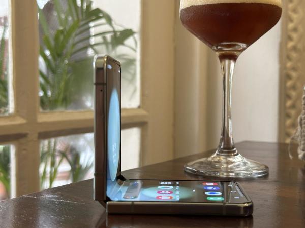
The hinge is sturdy and you can use the phone in Flex mode
The screen is sharp enough to show widgets and surprisingly the cover screen can go very bright, making it easily visible outdoors. Another great feature of the cover screen is the camera viewfinder. It’s now so much bigger and can be fully relied on to frame up shots. I can use the main camera to take selfies by keeping the phone shut. When you’re taking pictures of other people or they’re taking pictures of you, the cover screen preview can be turned on so that whoever is in front of the camera will also be able to see the framing.
The Samsung software makes the phone convenient to shoot videos. At first, the picture is a square but you can change the aspect ratio and also switch to shoot video or portrait mode directly from the cover screen.
You can freely zoom in and out any amount which wasn’t the case last year. I am also able to take pictures hands-free by just showing my palm to the camera, which is handy when group photos need to be clicked. Being a folding phone, it can work like a tripod and it’s a feature I have been using a lot.
The cover screen also allows a high degree of customisation and functional widgets. You can make multiple clock faces and then easily switch between them and there are lots of clock face templates that can be further customised with different fonts and colours. There’s even this new one that includes small widgets like the battery and date but, unfortunately, you can’t pick the widgets for each clock face.
Other than that there are much more widget options this year for the cover screen. I find that weather and stopwatch to be the most useful. And the Spotify app works beautifully on the cover screen. Just close the phone while you are playing a song and voila.
One way to run apps on the cover screen is by enabling it under advanced features but this only lets you run a few optimised apps. Some of the big apps are already there and I am sure more will be added in the coming days.
You can also have a full keyboard on the cover screen and it has good haptics. It’s fairly narrow but good enough for typing. Other than that you can check note notifications, answer phone calls and also toggle Quick Settings directly from the cover screen. Being able to silence the phone from here is useful.
Ergonomic design
The overall design is also adorably small and refined. On the top side you have a nice always-on display with two relatively small camera bumps currently. The AoD on the cover screen is just whatever the clock style is and there’s no further way to customise it.
The entire back of this phone is protected and glossy including the bottom half. It was matte last year but I think they changed it to match the texture of the cover screen. The aluminium sides go well with the colour options and it has some pretty nice stereo speakers as usual.
When you open up the phone you get a 6.7-inch screen with a hole punch camera at the top. The phone is just as tall as any big phone, like the Galaxy S23 and it actually shows about the same amount of content as the Ultra as well but it’s a lot slimmer. It’s about the same width as a small S23 and I do like this aspect ratio; it gives most of the benefits of a big phone in showing me lots of content but it’s still slim enough to easily hold and use with just one hand, especially since this extra height doesn’t come at the cost of having to carry around a really tall phone.
Also, there’s a very easy way to open two apps in split screen mode, just by swiping up with two fingers which is pretty nice for this screen. Samsung should talk about how bright the main display can get and it matches that of any flagship device.
It still has a screen protector with a pretty obvious outline around the front camera. On its own, the screen feels pretty sturdy. It doesn’t flex even when I press down on it.
When bending the phone some apps have a special layout, like the photo gallery and YouTube but there’s also a Flex mode panel that you can enable for all other apps; that basically gives you a trackpad along with some other controls. I found being able to skip forward or backward 10 seconds when playing media to be the most useful.
Another thing to know is that there’s no DeX support which is odd because all the S23s and the Z-fold have it. And they all have the same SoC.
Excellent camera
As for the cameras, at its price point, it’s facing some pretty strong competition in terms of hardware. With the cover screen you can take selfies with a much better main camera and ultra-wide. Ultra-wide selfies have a fun element and, at times, look better than the ones on the iPhone 14.
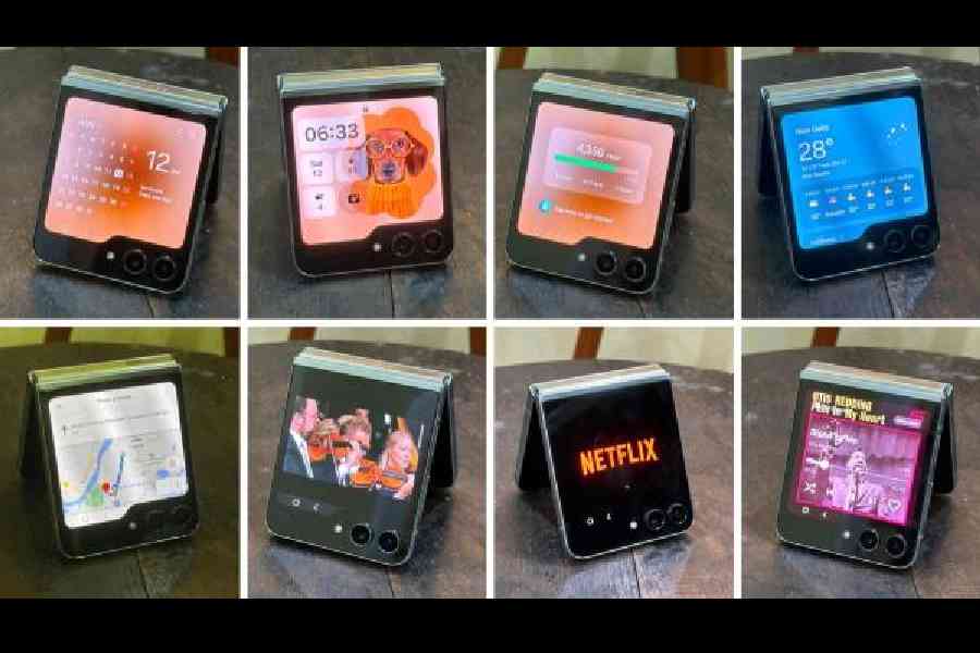
The cover screen takes up half the outside of the phone and can do multiple tasks, ensuring you don't have to unfold the phone
The Z Flip5’s main lens is excellent and it’s hard to tell it apart from the Galaxy S23. It has great dynamic range that keeps up with the best. The Z Flip5 doesn’t have a telephoto lens which might not be the worst compromise for a bigger cover screen. When it comes to videos, everything is top-notch. It’s just fun to take pictures with a small phone because of the cover screen.
Thumbs up for the battery
As for performance and battery life, Snapdragon 8 Gen 2 for Galaxy (4nm) seems to be quite efficient even with the same 3,700mAh battery. For one hour of running social media it’s around 20 per cent more efficient which is a great result. Keeping brightness high and running 4K videos, you will use around 30-32 per cent in three hours.
You may say, it uses less battery while playing games because the thermal throttles more than the S23. Honestly, you won’t find much of a difference in performance unless you nitpick. For a small phone, the battery life isn’t bad at all, easily delivering a day of usage.
Should you buy it?
There are rival flip devices — from Motorola and Oppo — but Samsung has done a far better job with software as well as design. Further, Samsung is delivering a hinge that’s far superior (a recent YouTube video didn’t show Motorola in good light). It’s not just about allowing apps to run on the outer screen; it’s also important to make apps appear optimised. Plus, Samsung is known for delivering regular updates and that ensures you will be able to use the phone for years. For most people, the Galaxy Z Flip5 will be ideal for everyday usage and that’s what Samsung has been aiming for years. The company has broken the form-factor barrier and things will not be the same again. At the moment, Samsung Galaxy Z Flip5 5G is the most innovative and useful phone of the year.

