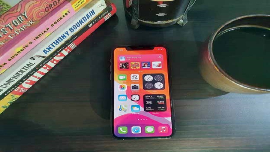
Once a phone leaves its box, it looks different from the 10 others that you may have in the drawer. It has all to do with home-screen widgets. Widgets are those tiny customisable icons that show time, weather, music controls and so on on the home screen. Those tiny thingies Android users often boast about. Widgets have been the ever-praised differentiator for Android. Google knew from the beginning that customisation is key and widgets have a bright future. Google was right.
Sadly, that bright future is being written by Apple with iOS 14. After years of keeping the iOS home screen static on the iPhone, Apple is finally allowing widgets. But Apple’s widgets take a leaf out of Windows Phone rather than Android. No, Android widgets have become boring and are not well-designed; developers don’t spare enough time towards it.
Like many aspects of the smartphone, Apple has managed to stir creative juices around the globe — like it always does with anything it touches — while getting the timing right. You know TikTok… that app which is getting knocked on its head with a broom? However much one may hate it, there is something unique about the video-sharing app — a sense of amazement as we move from one video to another, one just doesn’t know what would come up next. Yet, whatever comes up next fits well with the sensibilities of the user in question. Apple widgets enjoy that kind of spontaneity. The week started with a video titled “How to make your iOS 14 home screen aesthetic AF” getting over 24 million views on TikTok and is also available on Instagram. In fact, customisation craze has taken over iOS 14.
Customising the iPhone home screen
You can put widgets wherever you want, on any screen, interspersing them with icons and folders. It sounds like Android but it’s not. The widgets basically come in three different sizes — small, medium and large — and they fit into rectangles or squares, which means they fit into a grid that feels a lot like the home screen of the Windows Phone. And did we say that widgets are far nicer-looking on iOS than on Android?!
To use a widget, get into the jiggly mode… you know, long press anywhere on the screen. There are the minus buttons as usual and there is also a plus button on the left-hand corner of the screen. Get into the gallery of widgets and tap to see the available sizes. Grab one with a long press, drag it out and place it wherever you want.
The widget craze
Earlier in the week, the app Widgetsmith became the top free app on Apple’s App Store in the US. It’s an app that takes you down a rabbit hole, making you spend hours finding the right widget. Each widget can be customised — from background colour to border colour. It’s amazing.
There are also timed widgets that you can use to replace the widget on your home screen at a specific time of day. For example, you can display the current date until after the workday is over and then make Widgetsmith automatically change widgets to show you what’s on your calendar for the next day.
There is a free basic version or go premium with $2 a month or $20 per year. Since the app’s launch on September 16, it’s been downloaded over two million times, according to an estimate from Sensor Tower, an app analytics firm.
Users can combine Widgetsmith with Color Widgets and Photo Widget, another popular option; widget apps have been installed about five million times since iOS 14 was released on September 16. It has generated hundreds of thousands of dollars of sales, according to Sensor Tower’s estimate. That is the power of Apple.
Google has taken a potshot at Apple by tweeting a picture of a home screen on the Pixel 4A and the message: “Wait, we’re talking about homescreens now?” Yes, now is a good time to make Android app developers look into the widget situation and come up with better designs.


