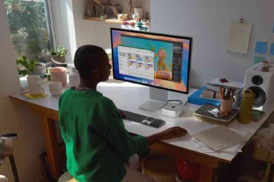
Netizens have plenty to say about the power button being moved to the bottom of the Mac Mini (M4). Is it difficult to use? Why was it done?
To access the power button one has to lift the unit slightly. Some techies on X and Reddit were quick to point out the convenience factor. The Mini is meant to be used in several environments, from home to during live event productions.
In an interview, two senior vice-presidents at Apple, Greg Joswiak and John Ternus, explained the relocation. According to the company officials, one of the reasons is the reduced size. Being five-inch by five-inch, the smaller footprint required the button to be placed at an optimal position.
Second, who switches off a Mac? Most users leave their Mac powered on, putting it in sleep mode. This means the power button is usually used when users need to force restart or force shutdown of the system. Further, the machine weighs very little, so lifting it is not an issue.
Also, waking up a Mac mini from its sleep state is quicker than performing a power cycle, but, it goes without saying, users on X tend to blow these things out of proportion.
The new Mac Mini is a marvel of engineering, something that was proved in a recent teardown.


