When the pandemic hit us in 2020, it made us break all connections with the world and forced us to stay indoors. Slowly but surely connections were re-established and much credit goes to app and game developers from around the world. One tech hub that has always been helping is Apple’s App Store from where we can download apps across genres. This digital space also fuels the livelihood of developers across the world. The company has been consistently celebrating app developers and this year is no exception. At the 2021 App Store Award, several developers were honoured and the top trend of 2021 — ‘connection’ — was highlighted time and again. t2oS spoke to the people behind three very successful companies via videoconferencing and here’s what they had to say.
Fantasian
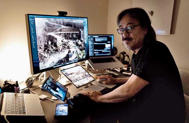
Hironobu Sakaguchi is a man known for mould-breaking video game titles, like Final Fantasy, Blue Dragon and Terra Battle series. Whatever he creates is always in equal parts art and cutting-edge technology, something that makes him deserving of the word ‘legendary’. The latest from the godfather of Japanese RPG is the Apple Arcade exclusive Fantasian (Apple Arcade Game of the Year), developed by Mistwalker, the studio he created after departing Square. The backgrounds and settings in Fantasian are real-world, 3D dioramas, and the attention to details is something we have never seen before. He takes us through his world of video games....
Working as if it’s the last project…
I approached this project as though it’s my last. I think what we were able to develop and create is definitely worthy of that mantle. With each new game, I always try to include some kind of innovation and looking back at Final Fantasy VII, for example, we rendered everything in 3D… CG and that was a big milestone at the time, and in the case of Fantasia, we actually developed all the environments in the background sets out of dioramas (a model representing a scene with three-dimensional figures). This is the first and possibly the only game to use dioramas in the backgrounds and, of course, it came with its own set of challenges, but at the same time it helped develop this very unique feel — this handcrafted sort of warm tone that you can’t achieve with any other medium.
A sense of realism…
See this cabin lodge (shows a diorama). This is an actual piece that we used in the game. You can see the attention to detail on this piece here. Around 150 artists worked together and collectively made 200 different environments that have been used in the game. And we wanted to make sure, of course, that the digital aspect of the game — like the characters or anything rendered on top of it — didn’t lose out to this. The dioramas team worked really, really hard, but I think it’s in a way kind of poetic because the story of the game deals with this balance of order and chaos. In a similar way, we’ve looked at this game as a kind of marriage between analogue mediums and digital mediums… coming together to create a single experience.
Creating realistic settings…
When we created these diorama set pieces, we used a technique often used by city planners to scan a 3D model of the city; so they fly drones through the city, take a bunch of photographs and then make a 3D render… 3D models of the city. We used a similar technique in which we took hundreds of photos of each diorama set piece and then used software to analyse and create 3D models and that’s how we got the model into the game engine. Then we took photographs — like really high-quality professional photographs of dioramas — and used almost like a projection mapping technique that you see on the side of buildings. Projections are then made on to different 3D models. Once we had that, the scene is in the game engine, so the photographs then become kind of this conduit that connects the analogue world to the digital world. We had photograph as a base and then we just made sure everything that we placed on top of that photograph in the environment didn’t overpower or under-power to what that photograph was doing; it is kind of connecting two worlds.
Conceiving the idea…

Hironobu Sakaguchi is the man behind Mistwalker studio, which has developed Fantasian, winner of Apple Arcade Game of the Year
Before I started working on Fantasian, I was developing a game called Terra Wars in which we wanted to use stop-motion animation for the characters that were made out of clay and they were placed into these big diorama sets and then we animated them by taking photos; moving it a little bit, taking more photos…. As I was working on this game, I had these massive sets that the characters were supposed to interact in, and I started thinking it would be really cool if 3D characters kind of roam in a much more massive world using these diorama environments. So I guess that was the inception of the game.
Coming up with the soundtrack…
The soundtrack was composed by a dear friend of mine — Nobuo Uematsu — who is well-known for his work on the Final Fantasy franchise, and we’ve been friends for around 35 years and because of that we really have a deep understanding of each other’s work, each other’s processes. In this case, I began by writing a story, writing up the scenario of the game, and I handed it to him. He was performing at a concert in Nagoya at the time, and we had the opportunity to spend hours in his hotel room just talking about the different themes of the game and at that point he just kind of understood what I was going for with the story and composed the music.
Clinging on to the craft…
Some of the smaller set pieces that can last, those I will have around my house, but the bigger pieces, of course, are massive dioramas of these environments… those we have stored in a warehouse. Unfortunately, a lot of these pieces, depending on how they were crafted, use a lot of either clay and some of the colour may fade over time while some of the wooden pieces just crumble. I don’t know how much longer we can preserve these, but the ones that are preservable, I’m definitely going to cling on to them.
LumaFusion

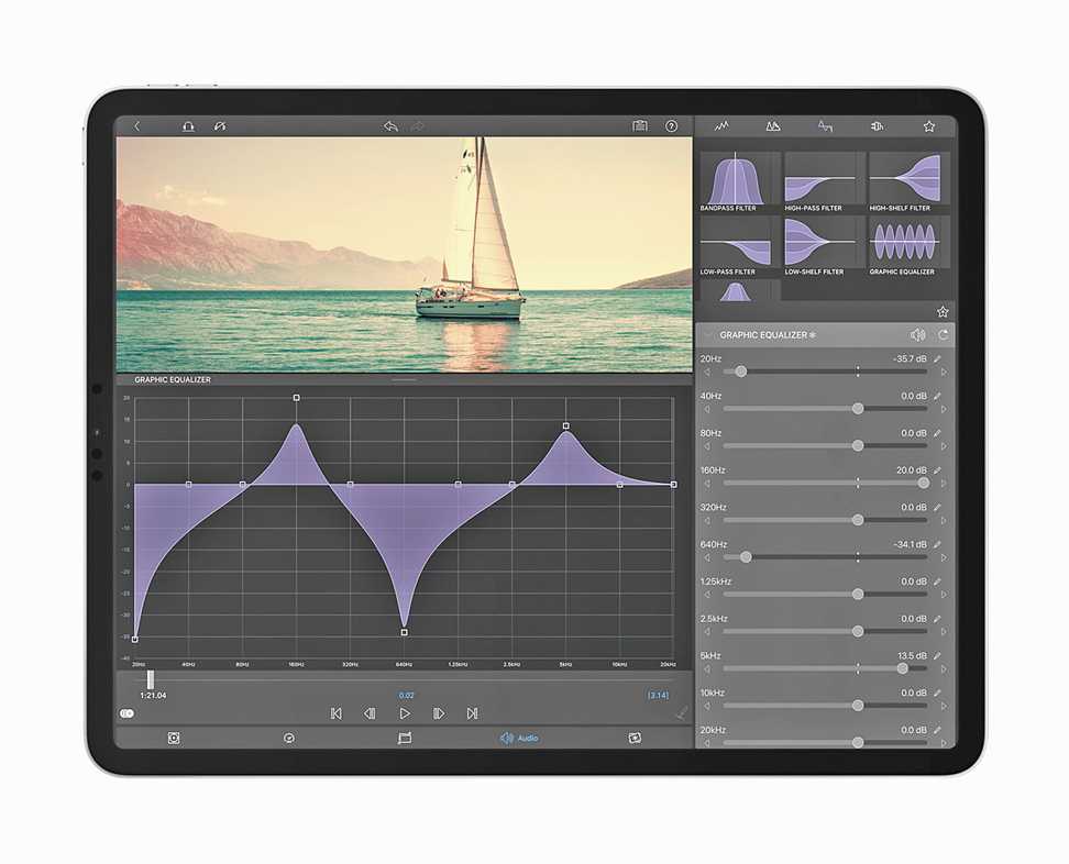
LumaFusion, from LumaTouch, is iPad App of the Year
It is video-editing apps like LumaFusion that bring out the best in the very powerful iPad. Support for six video tracks and six audio-only tracks? Check. Complicated mobile video editing? Check. Apple has been improving its iPad and iPhone (besides all the other hardware) year after year, making many wonder what can be done with all that processor power. Well, use something like LumaFusion, which has picked up the iPad App of the Year title. And rightly so. Since it first arrived on the iPad in 2016, it has made video editing less intimidating. We caught up with Terri Morgan (co-founder, product design) and Chris Demiris (co-founder, engineering) of Luma Touch.
Pleasing customers only…
Chris Demiris: We’re really proud to be an independent self-funded company without any investors to please and that means we can move quickly as the needs of our community grow and change. I think that’s really reflected in LumaFusion.
Terri Morgan: LumaFusion is a mobile app design for aspiring and professional video editors. The powerful multi-track timeline has precision tools for telling highly-crafted stories, a suite of audio and motion video effects invites creative exploration. Because LumaFusion allows just about anyone to learn to professionally edit, it comes as no surprise that our daily active users during the pandemic have doubled as everybody has interesting stories to tell.
Scaling up…
Chris: When we released LumaFusion in 2016, there were just three of us. Since then, we’ve grown to a team of 18 amazingly creative people with backgrounds in video, art and music, and we found that it’s only with a happy team and constant communication that we can create the best results for our users. When we started the LumaFusion we made a conscious decision not to package creativity only into canned templates and effects. Everything in LumaFusion is 100 per cent customisable or can be built from scratch. And that always leads to one of my favourite things. When customers share videos with us, we have to verify that these were actually created using LumaFusion beause we can’t tell just by looking at them and users are doing things we haven’t even thought possible with the app. One of the biggest advantages we have with LumaFusion is that rather than porting generic code from other platforms we built it on Apple Frameworks and the optimisation between hardware and software it provides. So LumaFusion runs incredibly smoothly on every iPad and iPhone, and it’s constantly improving with a lot less effort on our part, so we can focus on creating new features and workflows.
Terri: Our team focuses on human-centred design, so we consult our customers and watch our customers edit through the whole process. And the touch interface of the iPad and iPhone has actually given us the unique opportunity to rethink every interaction that a professional editor makes and find better workflows to get faster results and have more fun. In fact, one of the features in beta tests right now is multi-cam. That’s the ability to quickly cut between multiple synchronised angles. In LumaFusion you just drop clips to synchronise and then tap with your finger to cut and that turns a complex workflow into a fun and easy way of editing that anyone can do.

Terri Morgan and Chris Demiris are co-founders of LumaTouch
Use case…
Terri: I’d like to share the story of our customer Angelo Chiacchio. He’s a film-maker who set out from Italy to produce a documentary about the world we’re losing due to climate change. His editing suite was LumaFusion on an iPad. Angelo edited on site as his journey continued over 300 days, posting segments as he arrived at towns with Internet and now he is editing a full-length documentary called Ephemera on his iPad Pro using just LumaFusion.
Closer to storytelling…
Terri: After editing for 35 years on a desktop, one kind of feels like being stuck in a small room for a lot of years. With the iPad, you just pick it up and start editing. If I have an idea or if I’m on a shoot and I want to check cuts before I break the set, I can do that and that brings this sort of joy to editing that I had never experienced before. It brings the storyteller closer to the actual telling of the story, which is when you edit.
Chris: When we first started developing on the iPad second generation, we could get a glimpse of what was coming, but then we were no nowhere near to guessing as to what we now have on the iPad Pro. It has just blown us away. Because of the way LumaFusion uses Apple Frameworks, we get an amazing amount of performance increase without any work on our part.
CRAFT

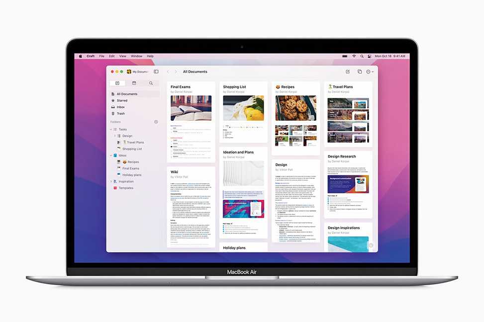
Most modern text editors look similar but most don’t put enough emphasis on the visual style of your notes. Take a look at Craft, which is the Mac App of the Year. Created by Luki Labs, Craft is a block-based notes app. Working with blocks makes the workflow easy because you can easily drag something to anywhere in the note, or, easily group blocks. And you can give each page a unique feel. We spoke to Balint Orosz, the man behind Luki Labs.
The eureka moment…
I was working at my previous workplace which was a large multinational company with hundreds of employees and 10 offices across the globe and my job as a manager was to collect, combine and distribute information to ensure that everybody is aligned. I realised we’ve been using tools which have been built for the print-and-paper age, and we’re trying to retrofit them to the digital world. If you think about the last 20-30 years… how much things have changed, how we as consumers consume information — we went from encyclopaedias to Wikipedia, which you can very easily click through and discover information. Yet none of this innovation is really brought to text editing and writing tools for the end users to use.

Making Craft special…
It has this flexible structure, so you can have notes within notes, and you can create links between them, just as you do in a website. This allows you to transmit very complicated messages in a very simple way where the reader understands the structure and they are in control of what they want to drill down and learn more about. Craft also allows one-click sharing with everything you write. You might want to export this in a number of different file formats that we support or just a simple URL, which you can share with anybody on any channel and as long as they have a web browser they will be able to see what you’ve been trying to tell. It works just as well on the iPhone as it does on the Mac and the iPad.
Use cases…
We first built Craft for ourselves. And then the last one year very quickly we grew to over 300,000 users and we have a very engaged community of over 10,000 individuals. And we’re talking a lot with them, and they are the main drivers when we’re trying to understand what is the next feature we’d love to build and where to take Craft. There are some great use cases. We see teachers who had to turn to online teaching; they are creating very rich material. We see architects and homeowners collaborating on projects like house renovation. Creative professionals like photographers really love to use Craft to collaborate with clients because they want to showcase their work in a way that’s visually appealing and is up to the standards of what they do and Craft enables them to just blend together images and text and share it at a very high quality.


