Each year at Apple’s Worldwide Developers Conference, the tech giant showcases what’s next for its biggest platforms — iOS, macOS, iPadOS and more — and, very importantly, what developers are doing to improve the apps and services experience. This year’s WWDC was special for the way Apple Intelligence was introduced and also for the many developers who were present to soak in all the new features that were announced. The iPhone maker demonstrated that it was still a purveyor of high-quality software and services. On the sidelines, we met the teams behind four interesting apps.
Team Gentler Streak
What is it?
Gentler Streak aims to improve everyone’s lifestyle, no matter who or where they are. The app is powered by optimistic and encouraging reminders that factor in both physical fitness and mental well-being. Its health data is smartly organised and seamlessly integrated to help users thoughtfully track exercise, rest, and wellness. In a Monthly Summary view, users are shown how they are doing in relation to their history, emphasising the focus on individual progression rather than comparison against others.
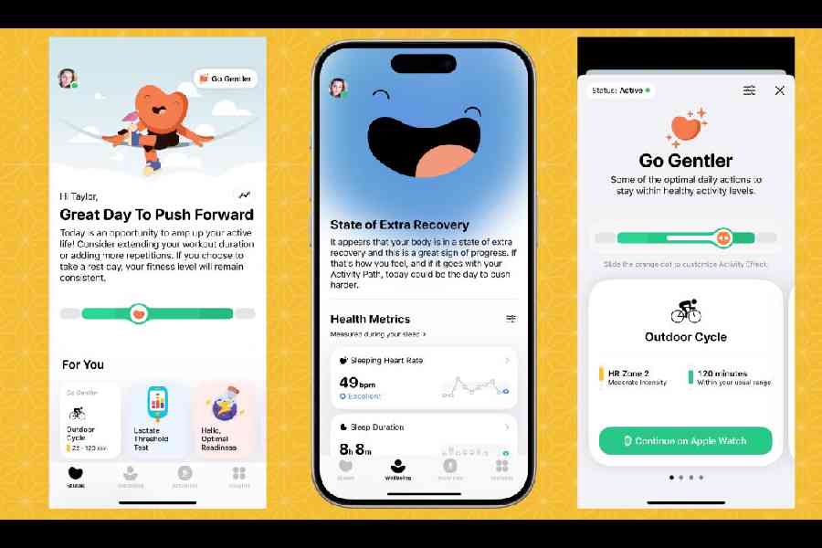
The different screens on the app Gentler Streak
Their story
Last couple of weeks I have been using the Gentler Streak app after I met the company’s co-founders — Katarina Lotric, CEO, and Jasna Krmelj, CTO — at WWDC. Usually, I wake up around 4.30 am to face the day but there are times when I would like to stay in bed a bit longer, which can cause anxiety — is it fine to break a habit once in a while?
Gentler Streak is about respecting the body and mind instead of settling down to a habit (for the sake of a habit). On the days I don’t get decent sleep, I should be staying in bed a little longer and update my morning routine around it. And then there are days when the body is more than willing to push boundaries.
Developed by Gentler Stories (from Slovenia), the app is brilliantly designed and has the user’s health benefits at the heart of it. “It’s essentially a fitness tracker that helps maintain a sustainable fitness habit. It’s our answer to the toxic approach to sports where it is about pushing for higher, stronger and faster. It’s not sustainable. You can’t go on like that forever. We are humans and our bodies are different and our capabilities are different. With so many burnouts around us, we are invested in creating something to bring exercising to everyone and make everyone feel included,” said Katarina.
Her view of the world is different from what many health experts are making us believe in. “It may sound funny, but we are living in a polarised world — you are either full-on or not. You either compete or give up.”
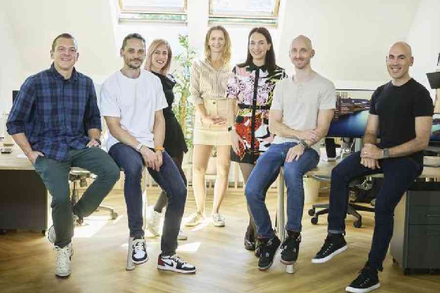
The Gentler Streak team
When you open any fitness app, there are just stats, which could be a good or a bad thing. “You don’t know what actions to take. On our app, you don’t have to know about stats (all the time). We summarise it and turn it into simple guidance. Today is a great day to push ahead.
“It is based on your fitness level and your activities from the last many days. And a lot depends on your heart rate. It is all about your goals and it’s not a challenge. It’s not based on what others have to say,” said Katarina.
All of your logged activities are there and depending on that your daily activity status gets generated. The messaging is simple: It’s an app that’s trying to be affectionate towards the user and help establish a better relationship with yourself. It is trying to motivate you to move but not exhaust you.
“The world is chasing the next big thing. So, it’s important to take a step back,” said Jasna.
Take the example of the Go Gentle feature: You get daily suggestions based on your history. Say you visit the gym. It will first ask you to walk and then go to the gym and then suggest how long and intense the workout should be.
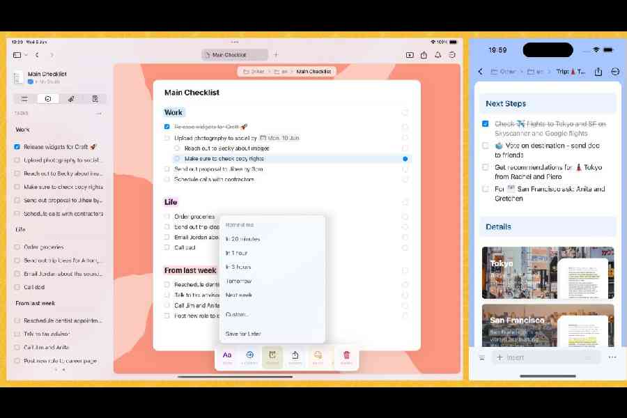
The Craft app on the iPad and the iPhone
“We don’t believe in a streak as it is. You don’t have to perform a certain action each day to form a habit. It’s a false expectation and you may get anxiety because of that. At times you have to push hard and at times you have to take it easy because we are humans. When you are sick, you need to take it easy,” said Jason.
The duo says that the app’s biggest customers are those in the 25-35 age group and one of its biggest user sections is formed by those who are just getting into fitness.
Team Craft Docs
What is it?

Artom Konovalov, head of product design Craft. Picture: Craft
Craft Docs is a versatile note-taking app, word processor and personal documents organiser all in one that makes productivity intuitive, fun and stylish. With Craft, you can fancy up your fonts, search for and add your own images (or those from a stock photo service), drop in fully formatted tables, and even style your section separators. And there is a helpful artificial intelligence angle to it.
Their story
Be it journalists or anybody who takes down plenty of notes, it’s imperative that we have the option to share a well-formatted document. Craft is known for its use of blocks, which hold not just text, but also files like images. This app might be right for you if you’re looking for something more visually appealing than a typical document page.
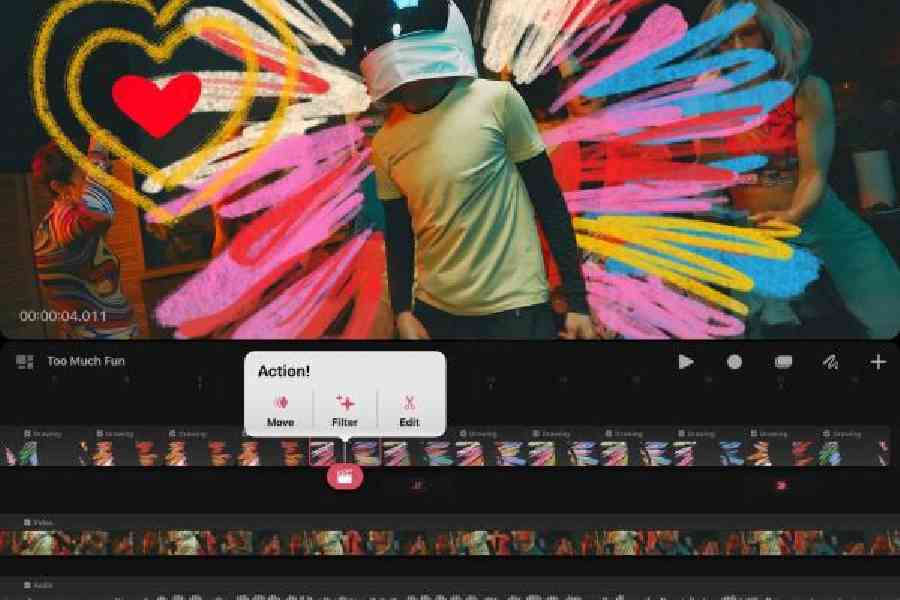
Procreate Dreams, an animation app
“In 2021 Craft won the Mac App of the Year Award and it encouraged us to do better,” said Artom Konovalov, head of product design, Craft Docs. You may have heard of Artom from Skyscanner days.
“We couldn’t do anything productive on our small screens or touchscreens and we had to always go back to computers and the quality of software for taking notes or writing documents and presenting stuff was bad. We felt there was a clear mission — the tools that we use day-to-day have to be of high quality. That’s where Craft comes in.”
Artom demonstrated how Craft Docs works with a recipe. Say you find a beautiful recipe in an old book and want to keep it for yourself for later use. You can easily scan it and move it into Craft. “We support dragging and dropping text everywhere. You don’t have to do anything extra. Since everything is in a block model, it’s easy to swipe and slide in large volumes of text and group them into sections, like ingredients and methods. I can also pick up the Apple Pencil and then scribble something without a keyboard (on the iPad),” said Artom.

Apple CEO Tim Cook addressing the audience at WWDC 2024 in Cupertino, California, on June 10
The idea of the team is to have a cross-device productivity tool. “We wanted to meet people where they are. Of course, it’s about text. I collect recipes. If I take a picture and move it into the recipe, we can use a feature called Live Text and select the text.”
Craft can be a great product for real-time collaboration with team members. You can invite team members with different permissions, assign tasks and add comments below blocks. You can also share a Craft page on the web.
Artom points out how artificial intelligence is an important part of the experience. “AI is a big part and one of the use cases users like is creating titles. The app checks the context and suggests a title. You can talk to the AI assistant and then ask it to make a title shorter or longer.”
Since we met him hours after the keynote at WWDC, Artom was still going through all the helpful implications Apple Intelligence will have. He said that as much as possible, the team will take advantage of the new technology.
“Our core principle, we want users to have a consistent experience. We will never give you a feature that we don’t know how to bring to another device, one with a different screen size. We also have a version of our app for Vision Pro; it came out around three weeks ago. It is again a part of the philosophy: I need Craft to be there because I am in the flow and want to use the product.”
There is another cool aspect to Craft — when you create documents, you want to share it. You can share it as Doc or publish it. Publishing works well when you want to sell an idea, so the document opens well in Safari. Documents created on Craft are going to get more attention because these show you have put in a lot of effort.
“Remember the times when we are needed to create long strategy documents and then are told to come up with presentations. Instead of redoing everything, there is a button in Safari and also in the app that transforms your document into a rough presentation. So you can share your screen.”
Team Procreate Dreams
What is it?
Procreate Dreams is a design tool that allows creatives of all kinds to create 2D animations using the extensive and familiar library of brushes, gestures, and PencilKit-enabled behaviours from the original Procreate. The controls are effortlessly intuitive, with support for both multitouch interactions and Apple Pencil. The app offers powerful animated effects, audio, and video to bring users’ creations and artwork to life.
Their story
One of the game-changing apps that launched in 2011 was Procreate, which made creating art easy and the iPad became the tool for a new set of customers — artists. It took another 12 years for the company to move to the next level with the development of Procreate Dreams, a new 2D animation app for the iPad that offers animation tools that anyone can use, no matter their level of experience.
What makes Procreate Dreams special is how it has been designed for the touch experience on the iPad. It comes with tools like Performing that enable users to automatically add keyframes to a project using gestures that record the animator’s actions in real-time.
“The new product that we have developed is about making art come to life. With Procreate Dreams you can make beautiful animations. We are doing a lot of work around multitouch, like I can zoom into the timeline and I can see a bit more. We are doing things that were not done before. You can throw in a video and then overlay graphics. Everything you see here has been custom developed for the iPad, all running in real-time. Normally, to do all this stuff, you need a big computer and a lot of RAM. This has been engineered to run on an iPad and it runs fast,” said Team Procreate.
When Procreate Dreams launched in November, one wondered how it could be appealing to Wacom users. Also, what can Apple do to make life easier for Procreate users in general. The answer arrived with the announcement of iPad Pro, powered by M4, and iPad Air, powered by M2. Add to the mix the new Apple Pencil Pro, which has features like the ‘Barrel Roll’ that allows animators to move and rotate objects at the same time while recording actions in Procreate Dreams, and the squeeze feature to activate software shortcuts.
Apple WWDC 2024 Design Awards Trophy
“There was a huge sigh of relief from the community,” Team Procreate Dreams told us. “We have spent years developing ultra raw real-time performance and a new way of animating.”
Procreate Dreams has been designed with the same goal as Procreate: It’s aimed at beginner and professional animators alike. Thanks to Apple’s nimble silicon, animation gets done very quickly. Even if you have 200 layers and plenty of keyframes, adding a new design element happens in the blink of an eye.
The folks at Procreate take pride in what they have created and how it can help people around the world: “More than ever human creation is important. Learning as a skill is something we have for life. Learning new things is important. With Procreate Dreams we are trying to just bring you in and make it gentler for people to enter the market. If you want to go deeper into key-framing, that’s there as well. We would love to see a lot of young men and women who were never exposed to animation try the app.”
Team MindBud
What is it?
With a mission to foster analytical and creative thinking, MindBud features four engaging mini-games designed for kids to enjoy with family and friends.
His story
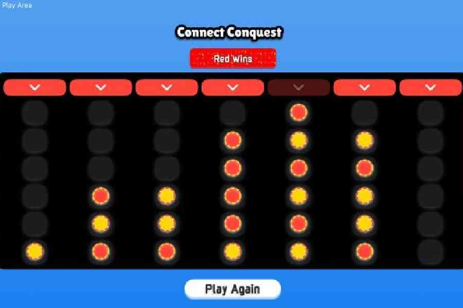
The app MindBud
Apple’s annual Swift Student Challenge recognises the best in student coding, and this year, it has added a new category to its ranks. Out of 350 winning submissions, 50 students have been named Distinguished Winners for building app playgrounds that stand out for their innovation, creativity, social impact, or inclusivity. These 50 students were invited to a three-day in-person experience at Apple Park.
Among the winners was Akshat Srivastava from Varanasi, who won Apple’s Swift Student Challenge. The student from BITS Pilani KK Birla College in Goa started coding at the age of 16 and his submission is MindBud.
“The idea for the app came when I was playing with my nephew, who belongs to the iPad generation and he watches a lot of videos on the device. I thought when I was seven I used to play a lot of board games and being a big comic book fan, I used tracing paper to draw cartoon characters. Why can’t I bring that experience to the iPad?” wondered Akshat.

App developer Akshat Srivastava
Leveraging SwiftUI, AVKit (audio), PencilKit, and FileManager, MindBud delivers a seamless and immersive experience to make classic fun learning meet the new age technology.
“There are four mini-games. The first one is like Connect 4 and you can collaborate with family members. The second part involves sketching and it’s my favourite part of the app. If your child wants to learn to draw, why not let him or her explore? The third part is a card-matching game like it was done in trivia shows back in the day. And the fourth one is around math,” he said.
The student got into iOS development only a few months ago and the “learning curve has been great”. “There has been a lot of help from the community. I code all the time and this app needed coding for three days, and then seven days were spent around UI. I love the Apple ecosystem and I want to work on more ideas,” he said.


