Using Windows 11 on the Microsoft Surface Pro 7 that comes with a touchscreen has simply taken my experience of the latest version of the operating system to a new level. After using Windows 11 for five-odd months (first as part of Windows Insider), there has been plenty of high points for a person whose first meeting with the Mircrosoft platform was in way of Windows 3.0 around 1992. Over the years I had shifted most of my daily work to MacOS because of video editing as well as the clean UI it has to offer.
The biggest problem with Windows I have had over the years is the lack of cohesion and even on Windows 10, parts of the OS represent different eras of the operating system; it’s like different teams have worked on the OS while the team leader forgot to share the design philosophy with all of them. Everything changes with Windows 11. Everything is new. Everything works seamlessly.
There’s fluidity
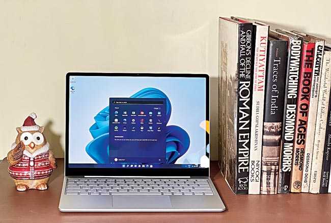
There is much more to Windows 11 than the Start button shifting to the centre. There’s fluidity, which gives a feeling of speed. Windows has always been fast but somehow MacOS has felt faster because of the high degree of animation, which has been missing or poorly implemented on previous versions of Windows. Say ‘hello’ to animations, which are quick and snappy, making the overall design come alive.
A lot of small changes have been made that add up to offer a big change. The most noticeable one is scrolling. Earlier, each movement of the scroll wheel on the mouse allowed to scroll text or menus a little bit at a time; there was something jittery about the experience. Now things are super smooth and the experience is closer to using a smartphone where scrolling is instantaneous. It’s as if you are in the world of smartphones but on a bigger screen.
Some of the other things I have noticed: The square corners of the boxes have been rounded off while the scroll bar expands when you hover the mouse pointer over it, both of which add to the smartness of the OS. A bigger change is the level of transparency each menu or app comes with. It’s ever so slightly transparent, giving a hint of what’s behind the box, which is just perfect.
Spring cleaning for settings menu
This has been a demand for long and many people have switched loyalty because it’s never easy to find anything on Windows 8 or Windows 10. The settings panel has been completely overhauled and there are proper visual representations, like if you want to make changes to the taskbar, everything happens seamlessly, complete with animation. Plus, settings is “now” searchable, meaning you can easily find what you are looking for.
The other part I’m enjoying about Windows 11 is the control centre on the bottom-right corner. On Windows 10, there are icons for speaker, Wi-Fi, Bluetooth, attached devices and so on. It has changed completely. Now it feels like you are using an Android phone. Instead of swiping down to access the control centre, here you click and it pops up to reveal options the way we have become used to.
App arrangement
There’s something interesting going on in the Start menu. When you click on it, there are the usual native apps that show on the menu and also third-party apps. On clicking them they get actively downloaded from the Microsoft Store. You may say that this is bloatware that hasn’t been installed but I don’t look at it that way because the company is showcasing apps that are interesting. And you can get rid of any app by right clicking on the icon and choosing ‘uninstall’. What would have been better (and maybe it will happen in the future) is if Windows starts showing apps that are important to me. If I am a video creator, it would be great if Windows can highlight those 10-12 apps that are important to a video creator; maybe I will check them out.
There is also an option to have multiple desktops. Though not my preferred way of working but I dig the idea. You are using the computer for office as well as personal work and want to keep the two lives separate. Instead of throwing all the icons on one desktop, spread them over two or three desktops. When you are in office mode, work on the office desktop, then there can be the personal desktop and maybe a gaming/entertainment desktop, each with separate icons.

Something like Microsoft Surface Pro 7 offers a good combination of touchscreen and keyboard experience on Windows 11
Widgets and photos
There are many widgets in Windows 11 and you can use the shortcut Windows + W to bring them up easily. There is the simple weather app, photos and so on. Then there is news aggregation. You can change the length of the widget and not the width while the implantation is very good. I see a lot of potential for widgets in the coming days.
Microsoft has ironed out another criticism from the past. The Photos programme has never been the best way to browse through snaps, especially the way it syncs with OneDrive. A lot of improvements have been made. Browsing through photographs and videos has become easier and I can do some basic editing on the photographs. You can also use extensions leading to third-party apps. And there is good integration with Windows Movie Maker; you can have transitions and text… things that are sufficient for most people.
Focus sessions
A very important feature for anyone who is spending long hours at a laptop. Focus sessions is nothing complicated but it’s such an interesting option that is a part of Alarm & Clock app. Once you visit the Focus Sessions tab inside the app, you can choose after how many minutes the computer will warn you to take a break. Once you sign in with your Microsoft account, you can create tasks and pick a task for a focus session and these tasks will be synced with Microsoft To Do. There is also a way to enhance your focus with music and podcasts from Spotify.
Microsoft Teams integration
There are many useful options within Microsoft Teams and at times it scores over other videoconferencing apps. Now that Teams has been integrated into the taskbar, more and more people will be using it to chat. I get the feel of a frictionless design and over the next year it should be able to take a considerable share from platforms like Discord.
It’s time to upgrade
If your computer allows, it’s time to upgrade. I haven’t even touched upon the big changes made to the Microsoft Store, which looks cleaner and has more options, besides allowing to you use many Android apps. In case you are planning to upgrade your laptop, consider getting something like Microsoft Surface Pro 7, which is a good combination of touchscreen and keyboard experience. In fact, I tried to work on several programmes using touchscreen only and things worked effortlessly. Moving into a renovated home always feels great. That old familiarity is there and so are big updates, like on Windows 11.


