The last few days have been spent playing around with all the new features that are coming with iOS 18. We downloaded the iOS 18 public beta, which anybody can use. Of course, iOS 18, to the general public, is coming this fall. We have put together a cheat sheet to help you learn about some of the new features that are coming your way.
The feature with plenty of spunk is Apple Intelligence, which includes AI photo editing and assistance with writing. The group of features under Apple Intelligence will only come this fall and is not part of the beta release. So, those aren’t on this list.
A clever update
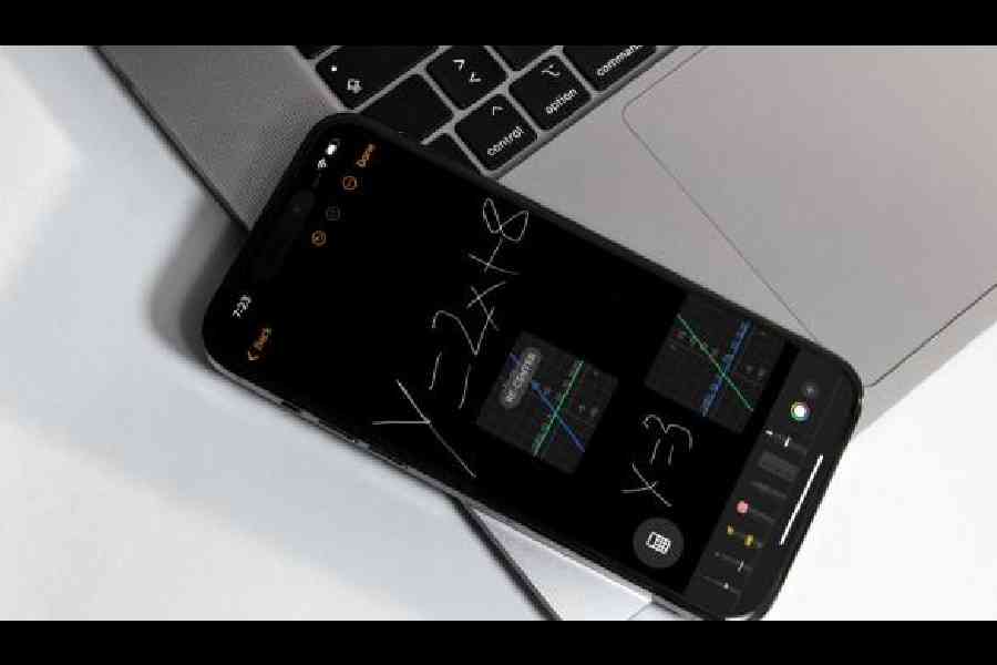
At WWDC, one of the most interesting offering was the Calculator app and we thought it was something for the iPad. No, it’s also on the iPhone. You open the Calculator app on the iPhone and then hit on the toggle button on the bottom left to bring up a menu that lets you switch between ‘basic’, ‘scientific’ and ‘maths notes’.
With the iPad, it gets simpler to use the app because you would probably be using the Apple Pencil. Nonetheless, the functions are all there on the iPhone version.

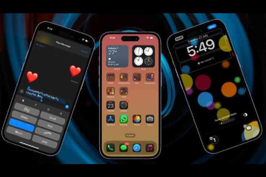
(Left to right) In Messages app there are new formatting options, you can place icons anywhere on your homescreen and even change the lock-screen app access options
When you begin a new session on the Maths Notes section, you will be given the interface of the Notes app. Either punch in the problem you want to solve or scribble it with your finger. As you keep typing, the math problem gets solved. If it’s an equation, it can even show you a graph using the variables. I have used the paid version of the Wolfram Alpha app but after using the updated Calculator app, it’s one cancelled subscription.
And the calculations that I do here can be solved across devices. Further, if you redefine a variable in the same note, the app knows the new value you gave it but keeps the old value you had written above the new note. For daily maths problems that I need to work on with my 13-year-old, this is a helpful update.
Home Screen customisation
With iOS 18, Apple brought in plenty of design changes and customisation to the Home Screen. You can put icons where you want, change their size, and give them new colours. Further, you can hide apps.
First, rearranging icons. With iOS 18, you can rearrange app icons and widgets on your Home Screen and app pages with space between them, providing a slew of new layout options.
Over the years, the company has gone with a grid system that allows you to move app icons within grid locations. In iOS 18 you can choose where to put an app — if you wish, you can have app icon-sized spaces between apps, a full empty row(s) and a full empty column(s). You can also put a single app in the middle of a page or have a row of apps at the top and a row of apps at the bottom. Basically, your wish is iOS 18’s command. But you can’t put icons and widgets in places with uneven spacing because of the invisible grid limitation.
The second option I like is customising the feel of the pages to “automatic”, “dark”, “light” and “tinted”. Apple’s own apps have both Light and Dark colour options that allows you to change the colour of the icons when you have Dark Mode turned on. You can also turn on Dark icons independently of having Dark Mode enabled, so you can leave Light Mode on while using the Dark icon option.
What catches the eye is adding a tint to the app icons, which is useful if you want to match a wallpaper. Remember, you cannot change icon colours individually, and the tint changes the shade of all of the app icons together. You can even use an eyedropper to choose a colour from your wallpaper. Tinting works with all icons as it desaturates and then places a colour over the desaturated icon.

The refreshed Calculator app comes with the Maths Notes feature
To work on this: Long press on the Home Screen or an app page. Next, tap on “edit” and then “customise”. Select “tinted” and use the sliders to adjust the tint to your ideal colour.
It is also possible to change the widget size. You can do this directly from the Home Screen without having to go into the customisation options. Widgets now have a rounded bar in the corner, which you can drag to make them larger or smaller.
Hiding and locking apps
It ideally comes under home screen customisation but can also be treated separately. iOS 18 includes a security feature for locking apps or hiding them from your Home Screen and app pages.
Locking an app requires Face ID to unlock. Hiding an app does the same thing but goes a step further by removing it from view entirely.
You’ll only see it in a Hidden folder in the App Library, which also requires authentication to access. Further, locked and hidden apps will not pop up in searches on the iPhone, they won’t be accessible by Siri without authentication, and notifications and alerts like calls from the app are disabled.
To access these features, long press on an app icon to bring up the “Require Face ID” feature. If you want to lock an app, tap on “Require Face ID” again. If you want to hide it, select “Hide and Require Face ID”.
The new Control Centre
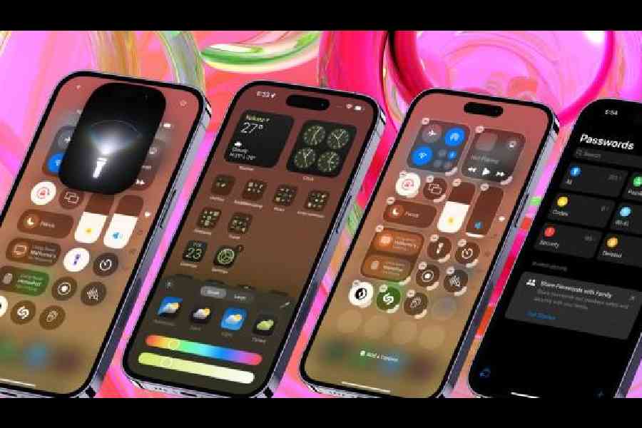
All the important controls that you need reside in the Control Centre which has looked more or less the same for years. Now when you pull down from the corner, the refreshed Control Centre is colourful, paginated and packed with options. Running across several pages, the second and third pages are fundamentally a full-page visualiser for whatever media is playing.
On to the first page. There are two important icons at the top of either end of the page — a plus sign and the other is the power button.
If you hit the ‘+’ button, a grid comes up that lets you play with the size and placement of anything that has a tab. You can design your control screen and add new controls from a long list.
Options include a single-grid circle, a two-grid circle that’s horizontal, which adds the control’s name, and a four-grid circle arranged in a square shape. Modules like volume and brightness can only be two horizontal circles in size. Controls like those for smart home accessories have more sizing options and can be four grid spaces long or four spaces in a grid, eight spaces, 16 spaces, or 24 spaces at maximum. The Now Playing control also comes with a similar set of options but can take up the entire grid.
Apple has said that third-party apps will be able to build in controls as well.
One of the updates that mesmerises me each time I visit the Control Centre is how the flashlight can be customised. You can control the intensity as well as the beam width of the torch. Not that it’s going to change my life but it’s something cool to have.
Another addition to the Control Centre will help a lot of people who want to know how to easily turn off their phone: A power button.
Since there are more pages in the Control Centre, you can have dedicated pages for things like connectivity controls, HomeKit devices, and Accessibility options. Navigating through pages is done by swiping up and down through the Control Centre.
Another interesting development in iOS 18 is that it brings Control Centre to the Lock Screen, making it easy to swap out the default flashlight and camera icons for new quick access buttons. There’s also an option to remove Lock Screen controls entirely. Several Control Centre options can be put on the Lock Screen, including those from third-party apps.Further, Control Centre controls can also be assigned to the Action Button on devices that support it, which includes the iPhone 15 Pro and iPhone 15 Pro Max.
Passwords app
It’s a new app that has come with iOS 18. How does it help? It streamlines login and password management. So far you have been able to store password information on your Apple devices through iCloud Keychain, but accessing passwords was a little difficult because the data was tucked away in the Settings app. This part of the process becomes simpler.
The app keeps all the passwords in one place for you to search through. It also supports some new features. There’s two-factor authentication and passkeys. And then there is some more. At the bottom left, you can create shared passwords and passkeys within a group of trusted contacts.
To change a Password, you need to load the Passwords app, search for the login you want to update, tap on Edit, and then tap on the “Change Password...” option. Or browse through Passwords using the “All” section. Tapping on Change Password opens up the website associated with the login and password.
Perhaps all these features will make you want to switch from the password manager app you’re using on your iPhone to Apple’s Passwords app.
Apple has not added the redundant step of having a master password for the app, so it defaults to Face ID, which is very secure. Perhaps having an Android version of the app will help those who work across both iOS and Android.
Photos app redesign
We have written about this earlier but here’s a recap of an app that’s integral to the iPhone since it’s used by almost every iOS user. The app is primarily divided in two main sections: a top carousel and a bottom area where a number of highly customisable content collections live. The carousel part is where you can access your Photos library and it is where resides go-to sections that you can swipe through, such as your Favourites album.
The other part involves Collections, which sort your photos into album-like views based on things, like recent trips, the people you spend more time with or the colleagues you end up taking the weirdest selfies with. There is also the ability to pin collections to a dedicated section of the app. For example, I have pinned selfies and trips.The idea: Everyone’s photo library is unique, so customisation helps to bring up topics that are important to you. You can also reorder collections to put them in the order you like. The ‘pinned’ collection section is helpful: Keep things that are accessed frequently at your fingertips.
And then there is the involvement of Apple Intelligence. Natural language search makes searching for photos and videos even more convenient. You can search for specific photos, by describing exactly what’s in them, like “Find Rajat running” or “Look for Rajat wearing a blue shirt.” The intelligence even extends to videos. You will have the ability to look for specific moments in clips so that you don’t have to sit through the entire video.
Messaging app updates
Apple keeps adding new features to the Messages app. With iOS 18, if you click on the little icon with ‘A’ and three dashes next to it, a number of text effects and formatting options pop up. There is the option to have a part of the text in italics, bold, strikethrough or underline and then there are eight effects — Big, Small, Shake, Nod, Explode, Ripple, Bloom and Jitter. And in tapbacks, there are more ways to reply. You can add any sticker or emoji to the tapback. The best option: It’s possible to schedule messages. If you happen to remember a person’s birthday that’s coming up next week, keep the message scheduled. Psst: RCS support is there in Messages but you already know about it.


