Continued from here.
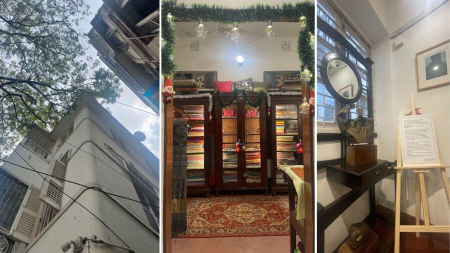
At first glance, Z’s Precinct at 18/76 Dover Lane appears to be a niche store in an elegantly raees south Kolkata neighbourhood. The kind of neighbourhood — bylane off a Y-lane off a bylane off a lane off a road — that watches its cousins across the city turn commercial and regret.
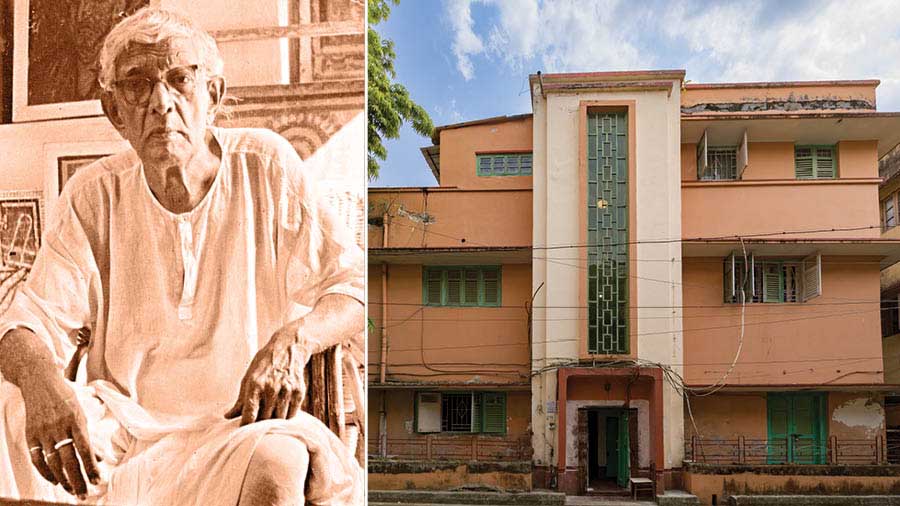
I went Saturday early afternoon. I found parking space. The art deco structures appeared freshly painted. There were no cafes where drinkers alternated between caffeine and computers. There were no bikes. There were no parking attendants descending on me while I was still backing into position — Kotokkhon thakben? (how long will you stay?). There was nobody. It could have been Sunday afternoon; it could have been Covid; it could have been a bandh. Just the kind of place where no serious business person would set up a store because it lacks those three words that define footfalls the world over – ‘critical population mass’.
This fleeting observation is a necessary preamble to why Z’s Precinct is the candle in the high breeze of Kolkata’s retail sector.
One, I don’t see a series of warm yellow lights spot-focused on merchandise shelves; the light here is a fusion of naked bulbs and filtered sunlight.
Two, there is no line of extended sight when the front door opens; one looks into a smallish room that leads into a smallish room that leads into a smallish room. How so un-store.
Three, the ceiling rises beyond the standard ten feet that has become such a part of our contemporary existences that anything higher is immediately ‘felt’.
Four, there is an absence of merchandise shelves; the shirts can be picked off hangers but when you need a shawl or an embroidered table spread, it has to be extracted from a cupboard.
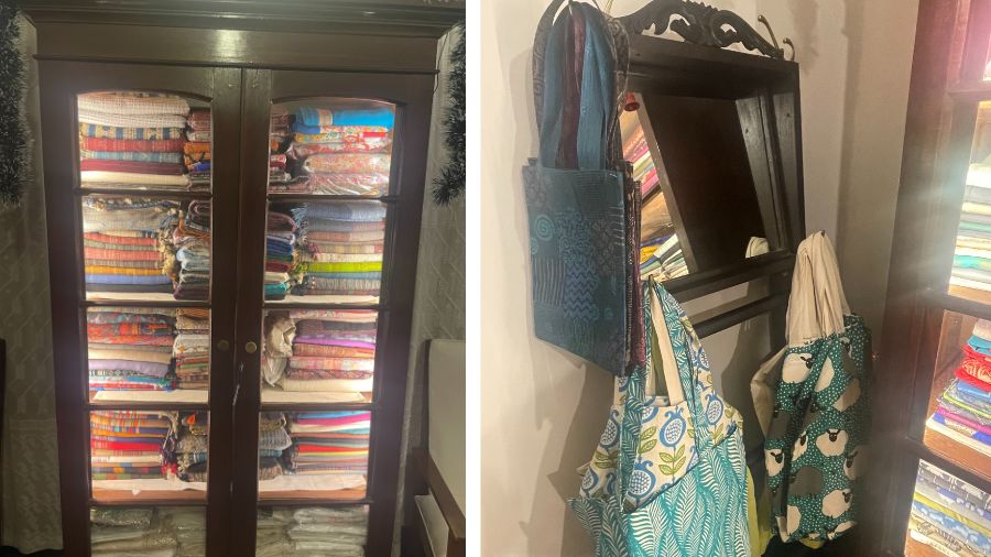
Light that is a fusion of naked lightbulbs and sunlight, to the absence of merchandise shelves — there is a lot that makes Z's Precinct stand out
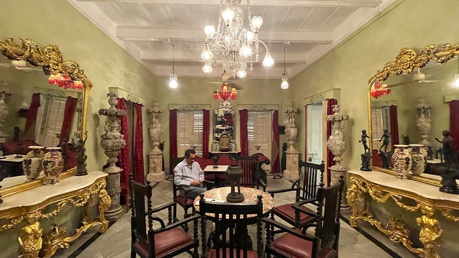
Five, the desk assigned on which I can scribble this interview is probably a century old; the chair is ‘Bawa adam ka zamaane ka’ (from the time of Adam), as mom would have said; the saris have been placed around typical circular furniture from the last century where the day’s cast-offs would have been carelessly dropped.
Six, the flower-shaped back-shade assigned to the light bulb is the kind under which north-Kolkata craftsmen huddle.
Seven, I find a complete absence of large format glazed tiles; the zameen is red cement (polished) and terrazzo. The only floor that is wooden was because the previous owner had put Spartek and this new rentee intoned ‘brand-destroyer’.
Eight, this is an old-world environment in a new-age business: everything is neat but not picture perfect; the red cement floor on the staircase carries the fade of the decades.
Why would someone set up an upmarket store in an uncommercial neighbourhood, destroying his last chance of breaking even by curating a conventional setting with no ‘glam’? Why would the interior designer (read ‘promoter’) leave everything just as it looked in the middle of the last century? Why would a store curator, with the experience of having headed the marketing function in the hospitality business of a prominent multinational conglomerate, extend the flavour of yesterday’s residential into today’s retail?
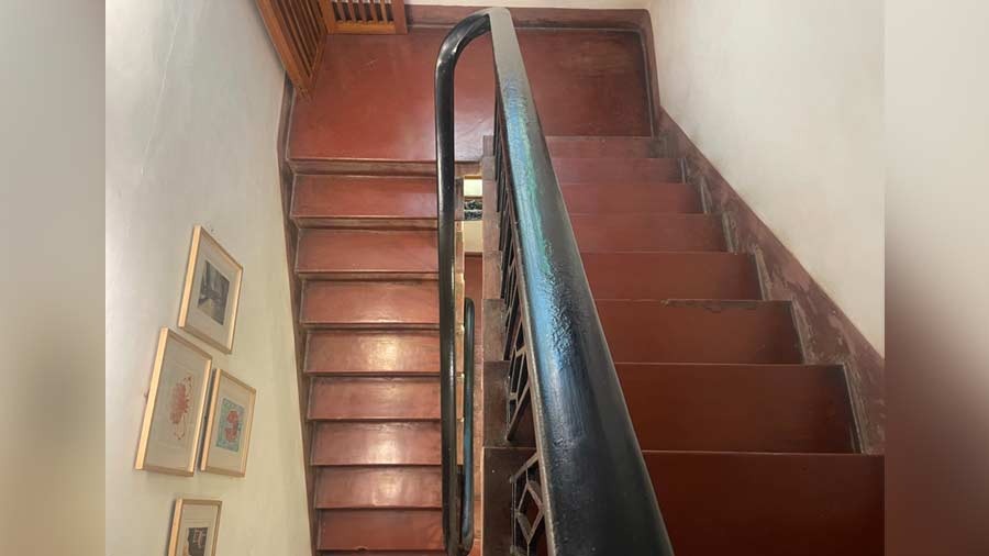
‘I find a complete absence of large format glazed tiles; the ‘zameen’ is red cement (polished) and terrazzo’
Rajesh Sen, promoter-curator, presents his case.
“Probably the first word that the interior designer used when this place was being designed was ‘remodel’. The designer started by saying ‘Oh, we can remodel this’ and ‘We can remodel that’. My opening brief was, ‘We will leave everything we find in its original state. We will preserve the interplay between the external architecture, internal structure and furniture, so that the visual language we speak is faithful, seamless and consistent.’ This was reinforced when I turned the suggestion down for blocking the metal ventilators high up on the walls. The designer said that blocking would protect air-conditioning effectiveness; I said that the inbuilt architectural ventilator would make the place breathe better. We had no disagreements thereafter.
“We even retained the fans – outsized by today’s standard. After we had been under it for a few months we recognised its utility: the blades have a gentle curve, the wide blade sweep provides a superior sweep as opposed to modern fans that run faster, are more energy-efficient but less effective.
“The fact that one sought to leave the place as it was didn’t require me to do nothing; it required one to think deeper. If one had re-modelled then one would have simply run an axe through everything. Responsible preservation took six months longer; the paint was meticulously scraped off the cupboards and that exposed the rich Burma teak. There were two chairs with complementary parts missing so we integrated the two and the result is one composite chair — the way it must have been, say, 80 years ago. The only important change was that the exposed electrical lines were internalised because we wished to create a museum. The rest is the way it largely was.
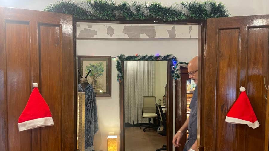
The responsible preservation of the art-deco building of Z's took six months
“A number of people ask: Why did you not remodel? My answer: I wished to create a social museum. There will come a time when modern consumers will fatigue of the artificial; they will seek the authentic. This place is as authentic as it gets: this is how people lived. The next question: why is it relevant? My answer is that the moment the consumer enters, he or she feels relaxed that there is no salesperson watching over her shoulder, the ambience is homely, everything is at eye level and proximate, the lighting is subdued and they can make the right ‘uninfluenced’ decision. This is how consumers would like to be treated. This makes a retail store of this nature relevant.
“Some time ago, a group of architects came from Edinburgh University to study the neighbourhood. After they had examined the application of our two-storeyed structure from the inside, they didn’t think they wanted to see anything else. After mapping dozens of homes and neighbourhoods, they came to the conclusion that this was perfect — the way we had retained and repurposed without remodelling.”
Responsible conservation needs to factor what the business will do. Will it be compatible with the architecture? Can both co-exist?
Rajesh Sen again.
“Z’s Precinct is more than a retail store; it is a multi-activity centre. This has helped de-risk from a complete dependance on one line of business. The result is that at the ground level, the store retails niche one-off textile products curated from across the country. The second level is a show area that serves as a gallery for events. The third level has been allocated to a studio apartment (to be revived following the pandemic). There is a fourth line of business where one curates heritage cuisine.”
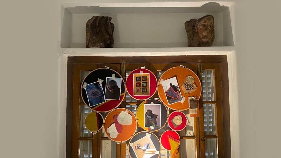
Z’s Precinct is more than a retail store; it is a multi-activity centre
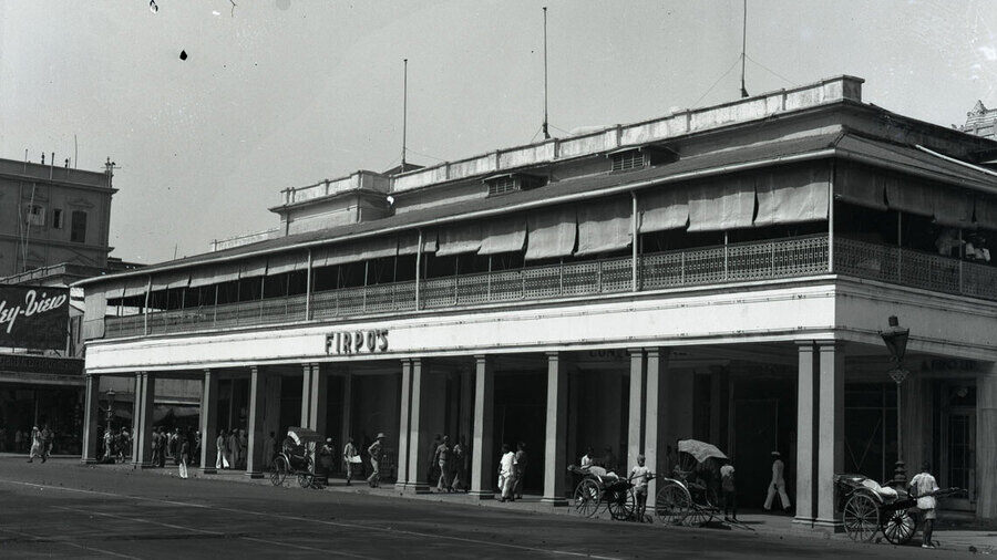
“My heritage cuisine has been derived from a study of the menus of legendary fine-dining brands of the yesteryears — Maxim’s, Firpo’s, Pelitis and the 300 Club being the most prominent. I also worked with an art historian (Pritha Gupta). We accessed dozens of menus; our process was marked by trial and error until we got the taste our predecessor chefs must have got. We now curate meals only as per order. We do not preserve; we do not freeze; we do not carry forward.”
By the close of the conversation, I began to get the idea: the intimate cosiness had been extended into the business model: no volume stocking, selective curation, one SKU of each design, products not available elsewhere, items personally conceived or handpicked, experimenting with what does not exist and curating the natural cum hand-made (‘breathes better, easy on the skin’). The result of this de-commoditised approach is that what one may lose out by way of volumes is more than made up by nicheness, sticker price, space saving and brand recall — ‘Kothaao paaoa jaai na’ (you don’t get it anywhere else). At Z’s Precinct, the space limitation is addressed flexibly: what is a show area one moment can be transformed into a dining area. The result is that it has more applications than one. It reaches more customer kinds. It enjoys cross-sale. Its advertising spend is zero.
Is there a future for this contrarian approach?
Rajesh tells me of one of his inspirations — the Koramangala (Bengaluru) home of Charles Correa. When it was sold it was expected that the new owner would say, ‘Let’s replace the floor with Kajaria’ or ‘Let us change the windows with Fenesta.’ The new owner simply said, ‘We will preserve the vision of the creator and preserve the integrity of the home’.
This home is now one of the better-performing stores of FabIndia.
