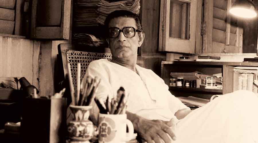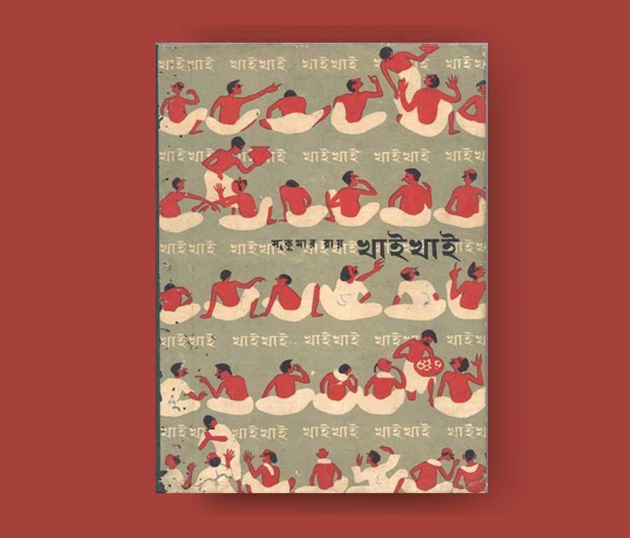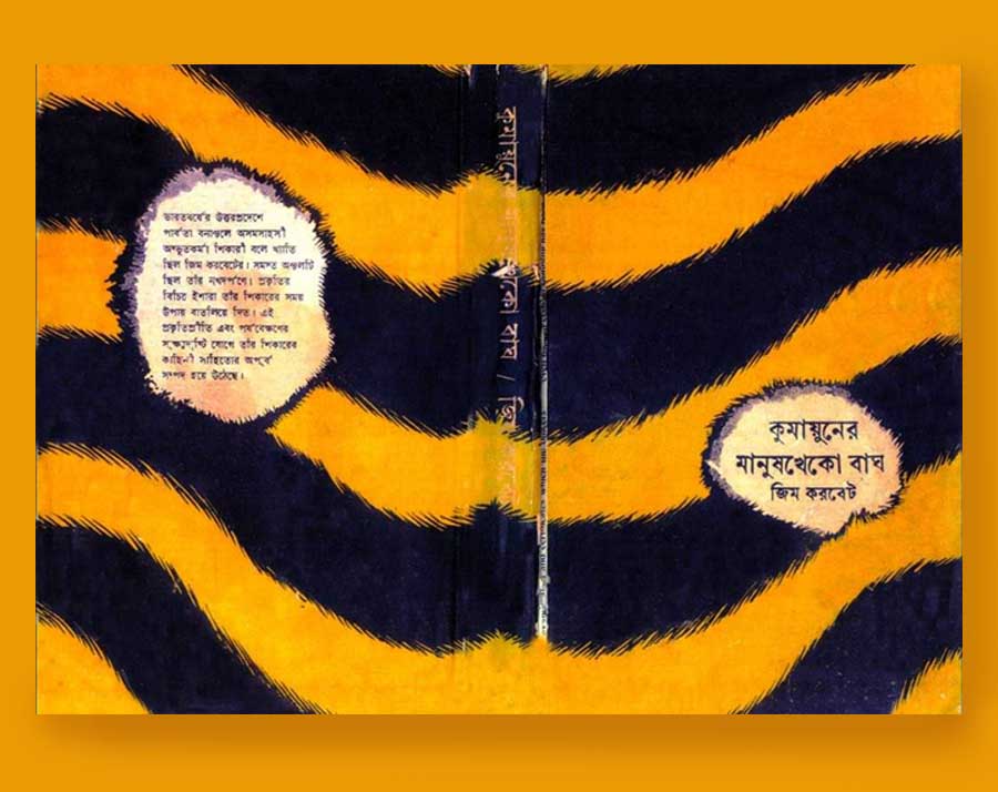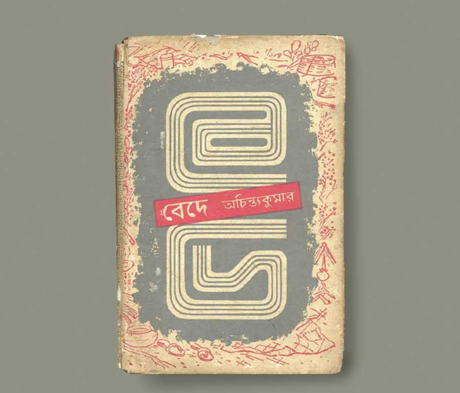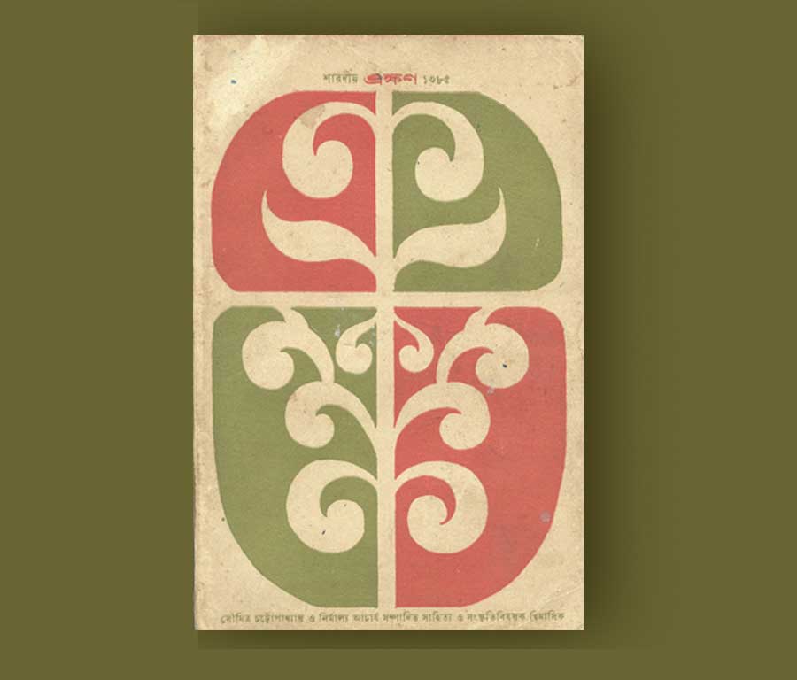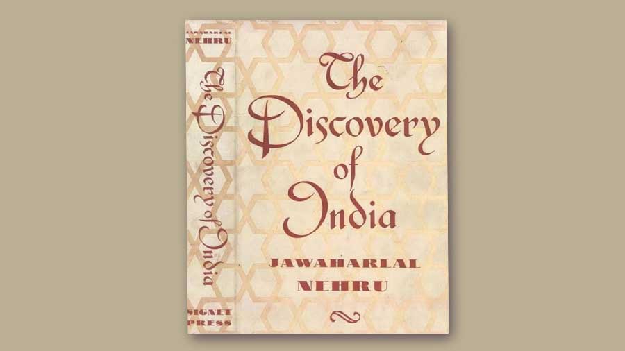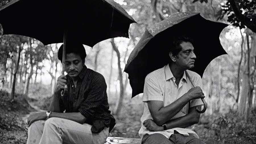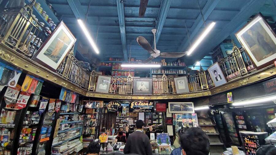
He drew design influences from Western art, calligraphy, Japanese wash techniques and even the art of Santiniketan. Ray also drew on traditional Bengali woodcuts and Kalighat ‘patachitra’ art for his illustrations His work transformed the way graphic design was looked at in the Bengali publishing industry in the 1940s
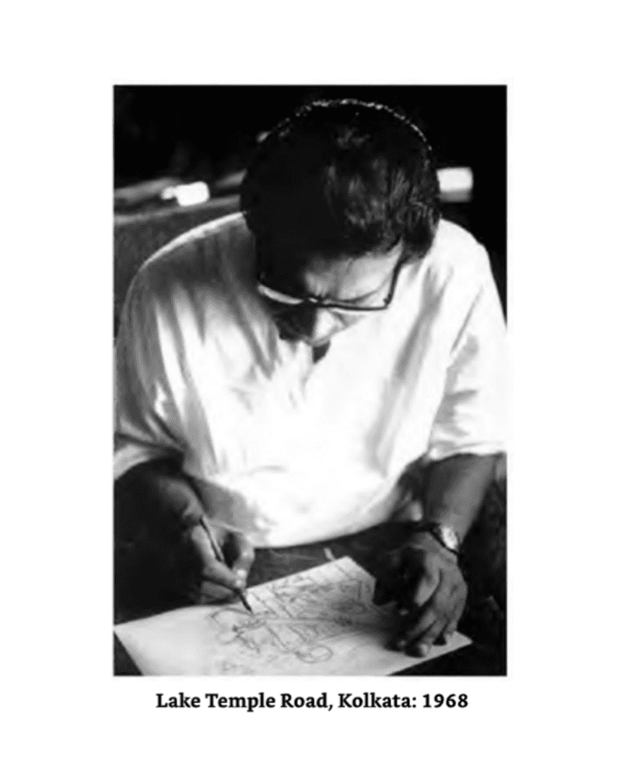
Manik Da: Memoirs Of Satyajit Ray by Nemai Ghosh, HarperCollins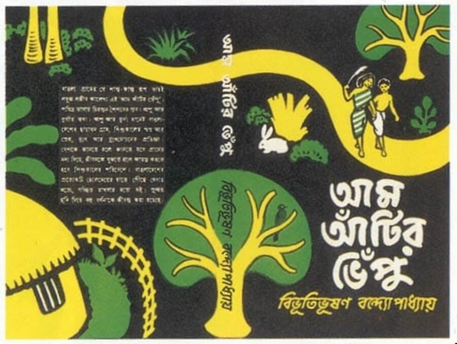
The woodcuts he created for Bibhutibhushan Bandyopadhyay’s ‘Aam Aatir Bhepu,’ an abridged version of ‘Pather Panchali’ for children, exhibit a simple vitality. Some of the scenes he drew at the time, such as the children huddling together during the storm, made their way onto celluloid
The Satyajit Ray Film and Study Center at the University of California, Santa Cruz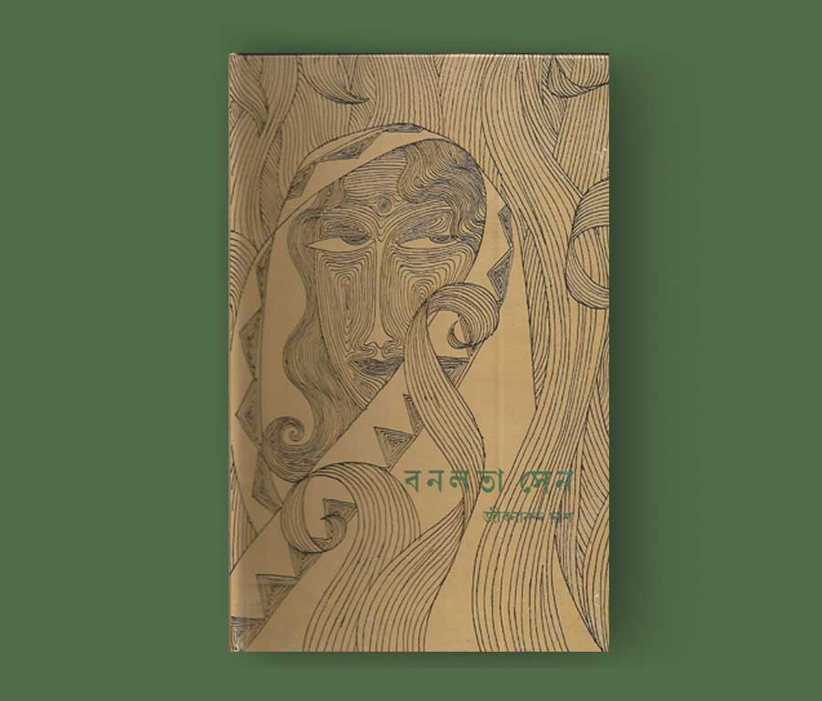
His cover design for Jibanananda Das’ ‘Banalata Sen’ is a homage to Rabindranath Tagore's paintings of the stylized female face. The texture created by the grey, neat lines in ‘Banalata Sen’ cleverly uses negative space to flesh out the contour of a mysterious woman peering from behind the foliage
The Satyajit Ray Film and Study Center at the University of California, Santa Cruz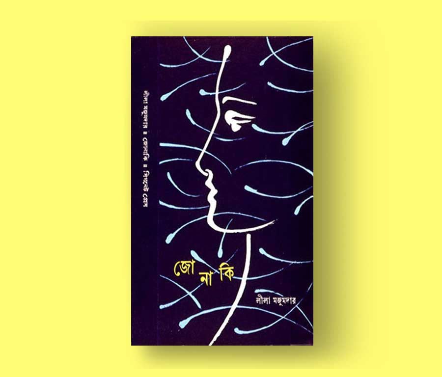
The profile of a woman is used as a motif on the cover of Leela Majumdar's ‘Jonaki.’ The title letters, separated and arranged in zigzag alignment, glow yellow against the deep blue background of night, emanating the ‘jonaki, or firefly darting around
The Satyajit Ray Film and Study Center at the University of California, Santa Cruz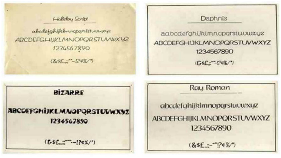
Ray designed four fonts for the English script, including Ray Roman, Ray Bizarre, Daphnis, and Holiday Script. Ray's fictional detective, Feluda, used his knowledge of typefaces to begin unraveling the mystery in ‘Feludar Goendagiri’, a short story and the first among the many in the detective series
Society for the Preservation of Satyajit Ray Archive