No phone has been as divisive in recent years as Nothing Phone (1). It’s the first phone from the London-headquartered company founded by Carl Pei, whom many know as the former co-founder of OnePlus. The short history: He left OnePlus in 2020 to begin his company, which has several investors many of whom enjoy (and like to enjoy) a fair share of the spotlight.
The problem reviewing this phone is that Nothing has been giving out information for weeks to ensure a steady build up, which is a clever marketing ploy and there’s no reason to knock Nothing over for it. But let’s try to separate the grain from the chaff because the biggest question that needs to be answered is whether the phone has enough to offer to make an early adopter out of you.
Carl Pei’s dilemma
We have reached a point when processors in smartphones are blazing fast for most workload while screen resolutions are high enough to make all offerings in a price category appear bright enough. And the camera? It’s still a battle while the actual war is design, or that’s what Carl Pei is making us believe.
If Nothing is seen in terms of a start-up, it has that one thing a business needs to become promising — design team. Enter Nothing employee Adam Bates. The former head of design and product experience at Dyson certainly knows a few things about, well, design. His job is to show that people who interact with any system on a daily basis deserve something better.
Of course, Apple has built an empire with focus on design but at the same time hasn’t let the innards of its devices falter. You must be wondering where are the specs, the figures, the component talk. Carl Pei doesn’t really want you to worry about that.

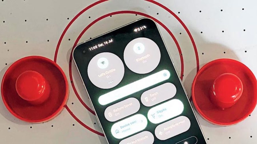
The user interface is smooth and free of clutter
Instead, you get a phone which has the skeleton of an iPhone on the back but there is more to it, namely the glyph interface that accentuates the transparent back of the phone. You read that right — the wireless charging coil is visible and so are some screws. And there are around 900 LEDs, which only light up in white. There is a selection of LEDs around the camera module, another on top right corner, another around the charging coil and there is a strip that mimics an exclamation mark. The interface is fun. Practical? We will get to that in a moment.
The different LED coils can be assigned tasks. When you get a phone call, the lights brighten and sync with the ringtone. You can assign the lights to glow in a certain way when you receive a call from a certain person. The LEDs light up when you interact with Google Assistant. There’s more. But to make all this work you need to keep the phone face down on the table. Here’s where the divisive factor kicks in. Are you the kind of person who likes to keep the phone in your pocket when in public? Do you keep the phone face down at the dining table? Is it easy to keep track of the different lighting permutations, like notifications, calls, yadda yadda yadda? Personally, I like to tap the screen to see all the info because I have little patience for decoding a phone call. At the same time, I know many people who like to keep the phone face down on the table. To Nothing’s credit, the LEDs have uniformity when it comes to the shade of white because it’s so easy to goof up with this technology.
The glyph interface is fun and that’s not a bad thing because I can’t think of any phone rear panel that has given so much joy. It looks like a distinguished purring cat.
Pei also delivers when it comes to the display. The bezels are absolutely symmetrical, hemming in the 6.55-inch 1080p OLED display with 1,200 nits brightness and 120Hz refresh rate. Even though this is not an LTPO panel, the refresh rate toggles depending on the app you are using. Further, there is 240Hz touch sampling rate, ensuring a very responsive screen.
More than baby steps
This is the company’s first phone yet, Nothing is delivering in oodles while competing with rivals that have been in the business for long. Let’s talk about the processor, which is Snapdragon 778G+. The company worked specifically with Qualcomm to enable wireless charging and reverse wireless charging. This is a stable chipset that ensures not too many sacrifices need to be made. Honestly, not many whom are spending on this mid-range phone would like to undertake heavy gaming on the mobile. Sure, you can play the best of games but the experience will not be the same as on a flagship number. But for everything else, you won’t feel let down.

Colours mostly appear natural and, at times, slightly warm
Cameras are restricted to two 50MP snappers, one wide and the other ultra-wide As far as first generation cameras go, this is pretty awesome. I don’t remember any early OnePlus phones delivering such good quality photos. The ultra-wide needs more tuning because the colour shift is visible when coming from the main snapper. The glyph interface helps with its lighting when taking macro shots. Otherwise, nothing much to report here and it’s enough to say that colours appear natural.

The camera module on Nothing Phone (1) punches above its weight even though this is the first phone from the company
Third, battery life. The 4,500mAh battery is sufficient to last you a day. There is 33W wired fast-charging (you have to buy the charging brick separately) and support for 15W wireless charging. All this is fine because you are getting six-seven hours of on-screen time.
Should you buy it?
In case you are head over heels over smartphones, you may say that Nothing is not hesitating to compare Phone (1) with the iPhone because it doesn’t want to attract comparisons to other Android phones in the same price bracket. Of course, you get a very able phone in Samsung Galaxy A53 with enough Android support. But that would be missing the point. After a long time we are seeing a phone with a clean interface, free of bloatware, an extremely fluid software experience and an openness to interact with accessories from other brands. Perhaps the question that we need to ask is whether Nothing can sustain the transparent design philosophy for long as it launches more devices. A smart speaker could be a good next product. Then what? For the time being, forget all the hype around the phone and ask yourself a question — are you fine with having a smartphone that’s fun to use, kicks off a conversation and lights up the mood with a glyph interface? If yes, this is great choice. Nothing Phone (1) is Carl Pei’s Mission: Impossible moment. He chose to accept the assignment and it looks like he will deliver sequels.

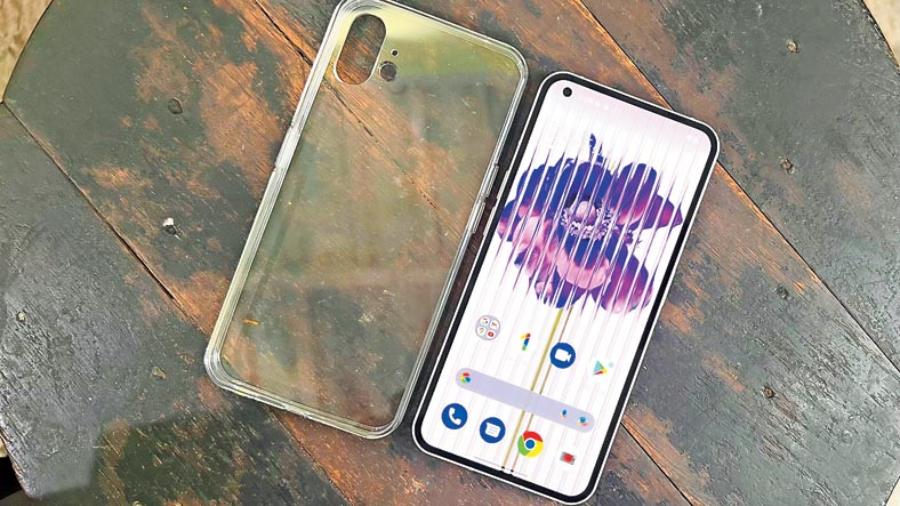
You can buy a transparent back cover from Nothing
At a glance
Device: Nothing Phone (1)
Price: Upwards of Rs 31,999
Goes on sale on: Flipkart, starting July 21, 7pm onwards
You can also buy: Nothing power (45W) adapter is priced at Rs 2,499; Phone (1) case is priced at Rs 1,499; and, Phone (1) screen protector costs Rs 999
High notes
- A design like no other
- Fluid interface
- Free of bloatware
- There’s the hope of delivering better Android phones
Muffled notes
- Questions over reparability factor and the life of the LEDs
- IP53 is not enough protection
- Audio could have been louder
