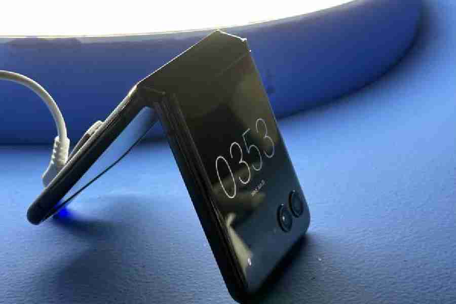
When the foldable smartphone made it to the market a few years ago, there was enough excitement because of the degree of flexibility it offers. In 2023, the foldable flip smartphone is turning out to be a practical solution for many people because of its size and also because of how much can be done on the outer big screen without opening the phone. This is particularly seen on the latest Motorola Razr 40 (Rs 59,999) and Razr 40 Ultra (Rs 89,999). The Ultra has an outer 3.6-inch screen to complement its 6.9-inch main display. You can run almost any app on the outer screen, meaning you don’t have to unfold to get most of the work done, which indirectly means less doomscrolling.
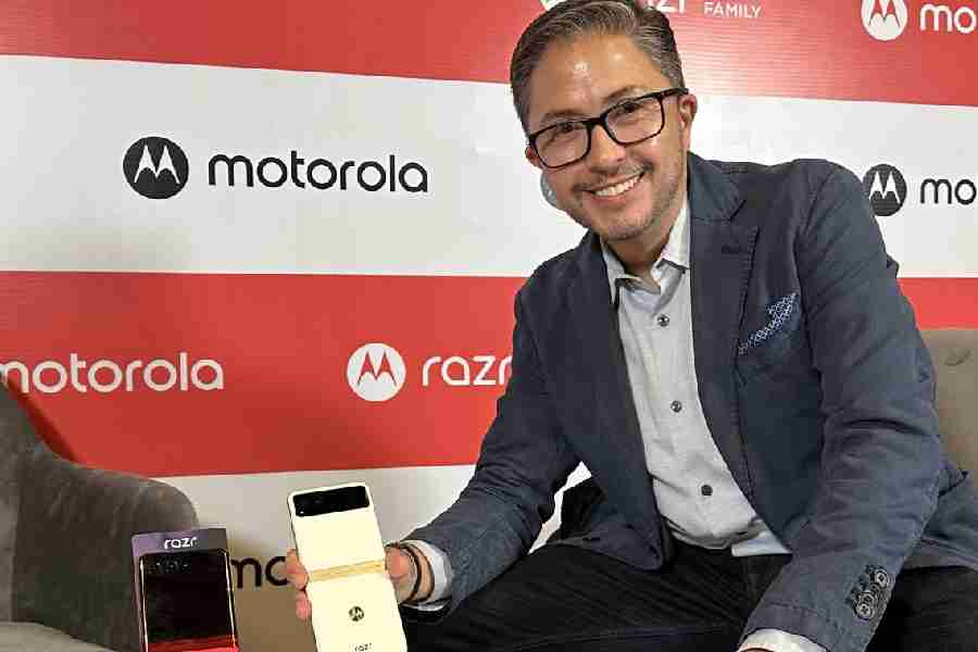
Motorola’s unique take has been made possible by its design team. We sat down with Ruben Castano, global head for customer experience and design, Motorola, in Delhi, before the unveiling of the new devices, which will be available July 15 onwards.
What kind of consumer inputs did you have while designing the product?
I think the strongest driving factor has been consumer input. We have over 1,000 data points, specifically on form factor. And those 1,000 data points relate to very functional areas, like dimensions and size of the device, basic things like the location of interactive elements, volume keys… to more intrinsic things like what kind of functionality is the right one to have when the device is closed or when it is open… to even more emotional factors, like nostalgia, attachment to the original Razr. All these data points drove us to evolve from the first to the second to the third and now the fourth generation of Razr.
The big novelty is that it’s a family; it’s not one device, it’s a family of products. Because of how they’re built, because of the hardware that is needed to create this type of form factor, these demand a very premium price point.
The challenges of creating a flip phone are different from that of a usual smartphone.
Let me start with the hardware that’s needed for this form factor. It’s all about space. Since the device folds in half, everything has to be duplicated. Two sets of batteries, two sets of PCB boards, and a lot of cables connecting the flip to the base. And so that demand for extra components and extra space is always in conflict with giving more to the end consumer. But with evolving technology, we’ve been able to still make the device extremely thin, extremely pocketable. And we’ve actually added more battery, wireless charging, stereo speakers, the massive external display onthe Motorola Razr 40 Ultra.
From a software perspective, I think there aren’t many limitations, to be honest. A couple of generations ago, Google was not ready to do dual-screen support. So a lot of that heavy lifting had to come from our side, we had to collaborate with teams at Google. Now dual screen support is there. So it’s actually more about opportunities, and how we at Motorola take advantage of dual-screen support to differentiate great new opportunities for consumers. What we did on the Razr 40 Ultra… I’m very proud of because the way it adapts to different modes of use, the way it can be put in different angles, for creating, for consuming, for just allowing consumers to capture and share content in different ways.
What I like about the form factor is that I can get most of my work done on the outer screen, which means less of doomscrooling. It changes our interaction with the device.
While consumption of content and maybe of apps are a big driving factor of the mobile industry, we can’t forget about consumers. There’s a big trend with younger consumers: Stop being face down into your device and be face up talking to another human being. The massive external display allows consumers to do exactly that… do many things quickly, without getting immersed in the larger screen. We have connected with the emotional needs of consumers.
Usually, battery life poses a problem with form factor. Have you been able to make a substantial difference?
I think lasting a day is a very reasonable expectation, something we need to deliver to consumers. The external display on the Razr 40 Ultra helps to achieve that. Like you said, it allows consumers to do a lot. But this is a much smaller screen than always having to open up and fire up a 6.9-inch internal display. That, combined with our knowledge of the chipset that we have selected for these devices, and some other areas of software and algorithms that we have, gives us the confidence to deliver on consumer needs.
What kind of support did Google offer?
We partnered with Google to make sure some of the key applications, like maps, messaging and payments, were all enabled and working well on the external screen. We went further than that. We have partnered with Spotify and designed a custom panel for playing music and also for discovering music, directly on the external screen. We’ve created a platform with this very large external screen that is ready to continue to evolve depending on consumer needs. The needs of consumers vary from market to market. I gave you the example of payments… being able to do payments with the device closed was very important in certain parts of the world. We were required to create a platform that is flexible. And then we needed to use that to address consumer needs, across different regions.
When it comes to design philosophy, a company is inspired by its surroundings. Apple is based in San Francisco and has a different approach. You guys must be having a different take because of where your engineers work from.
We’re a global company and I’ve been with the company for 18 years, always within a design function. Our design principles have remained stable all throughout. Our designs are always characterised by their simplicity, by their richness. I think this device is a great example of that. The richness of which we always try to express through the materials, the colours and the finishes that we select, and then we always like to add an element of surprise. The element of surprise always brings a smile to consumer faces. Once again, using the Razr 40 Ultra as an example, the multiple ways you can use it is surprising. These smartphones are fashion statements, there are products that you carry with you throughout your day. So we can’t tie Motorola design to a specific way of doing the form factor; it needs to evolve with how consumers are seeing other industries evolving. Take the example of the chin, which was so famous on the original Razr; it was there on the original design and then it was smaller on Gen 2 and then it slowly disappeared.
The phone design this time needed to take off from where you had left the previous generation. It’s unlike designing the first generation of a phone. What was the workflow?
Great question. There are multiple vectors that at some point need to converge into what we lock and say this is what we’re taking into production. Some of those vectors are definitely design trends and consumer trends that we take into account. And those have an effect on the form, those have an effect on the colour, materials and finishes that we select for the device. Consumer research has a lot to do with how we develop the design. Very important to the form factor is the width, the size of the product, the way it fits in the majority of consumer hands easily and comfortably. Those are ergonomic factors that also drive a lot of the design of the product. Once you know what those key ergonomic factors are, then you need to start to work with, for example, suppliers and mechanical engineers on selecting the display size and selecting custom displays.

Ruben Castano, global head for customer experience and design, Motorola
