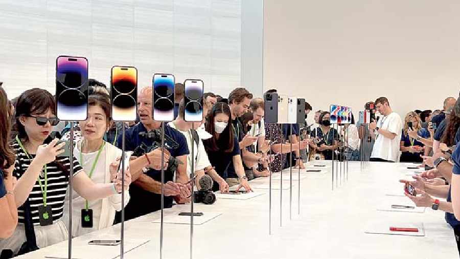
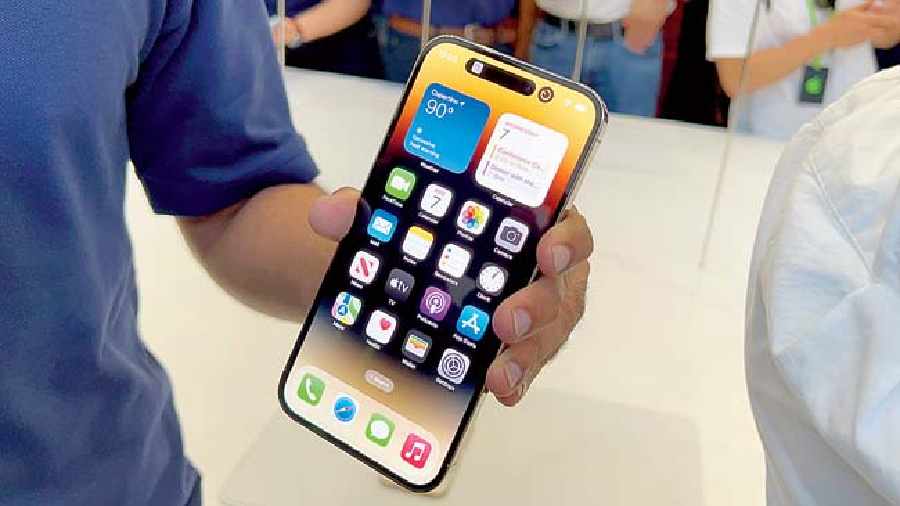
The most Apple-y thing to have happened this year is the introduction of the Dynamic Island. It’s the biggest design change since the iPhone X introduced the notch. In a way, the notch we know on the iPhone has undergone a design transformation to become the Dynamic Island. But it is way more than dealing with dead space. Apple has always done animations well and Dynamic Island is a reminder of that.
When you see what Apple has done with the software, you will love the Dynamic Island. Everything feels like a part of the interface. It brings together the physical side of the phone with the software side in an organic fashion. In terms of design, I think it works way better than the traditional notch.

iPhone 14 Pro and iPhone 14 Pro Max on display.
Until the Apple event took place last week, we were talking about the pill-shaped cut out for quite a while but what we weren’t expecting is Apple’s Dynamic Island feature, which came to fruition relatively recently. There are so many things we were not expecting.
Apple is one of the few companies that puts time and money to make dead space come alive and be useful. Dynamic Island can morph into different shapes and sizes for things such as incoming phone calls, alerts, notifications, Face ID, authentication, timers, turn-by-turn navigation and so much more. The pill-shaped cutout takes up far less space than the traditional notch. The traditional notch served no purpose other than allowing you to use your front face for camera and during Face ID. Here Apple gives us a different look.
And it’s not just about having more screen real estate. It is not limited to notifications and alerts but also on-going activities, like directions in the map, music that might be playing, you can see how much is left in your timer… these remain visible on the top and you can act on it. You can tap on it and swipe for different functions or you can long press in certain apps, like calls, bringing up a more widget-style of display of information. Long press and get into the music player. Apple’s new Live Activity feature which comes with iOS 16 will also be used in this Dynamic Island area.
Now, let’s say you are using the iPhone and browsing the web, but also waiting for your ride to pick you up, the Dynamic Island can help with that because it can display that useful information. There can also be two elements — one side the music that’s playing in the background while on the other, say, the timer. Tap and it comes up. You don’t have to swipe down.
The best part is that it is not going to be restricted to system functions. Developers will also be able to update their apps to take advantage of Dynamic Island if they chose to do so. It’s good to see Apple open up to third-party developers.
