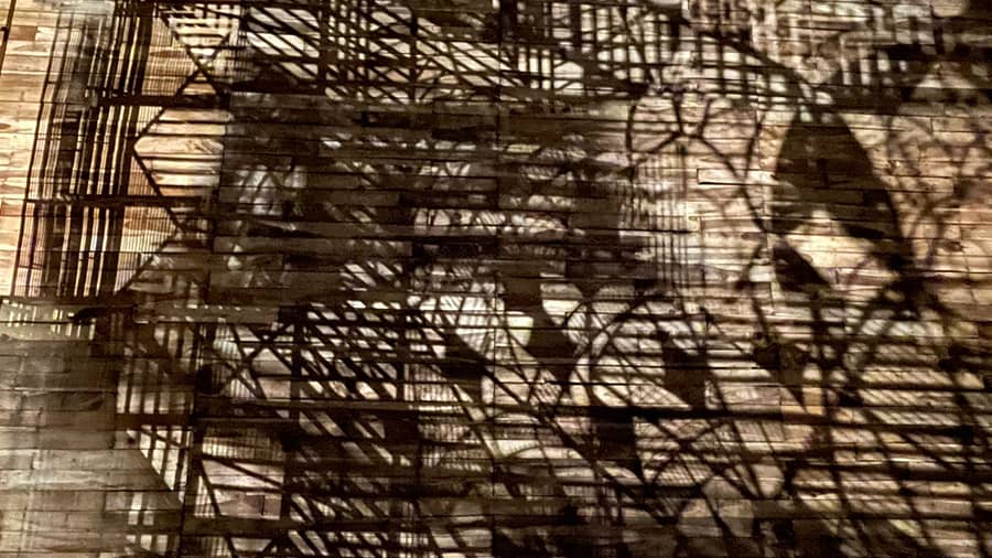
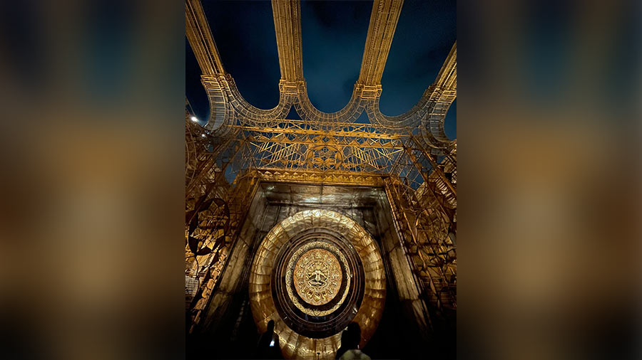
Shadows: Anyone who chases shadows will spend time facing the walls and wooden floor at this Haridevpur puja. Most pujas accentuate light (as a metaphor for goodness); this puja dared to contrast. Was this accidental given the shape of the installation? My hunch says it was deliberate; lights were placed at specific angles to highlight metal curves and lines. I was fortunate to go at a time when there was hardly anyone around, so one could shoot virtually anything without visitors standing into the shadows or breaking my phone camera’s line of sight.

Shiv Mandir, curated by Sourajit Banerjee Photograph: Mudar Patherya
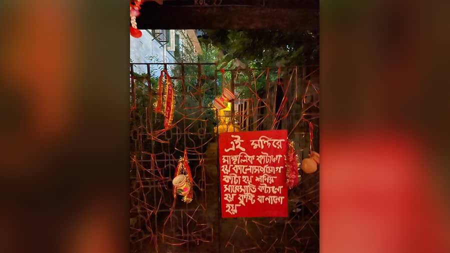
Graffiti board: At this puja (set in a ruralised urban setting), I fell for this graffiti board hung around one of the buildings, indicating that the neighbourhood had been inducted into the story-telling. Most would have designed red on white (this designer did the reverse); most would have used formal typeface (this designer used the manual); most would have fit the lines as neatly as possible (this designer used one translucent paint layer, enhancing the mood.

Shiv Mandir, curated by Sourajit Banerjee Photograph: Mudar Patherya
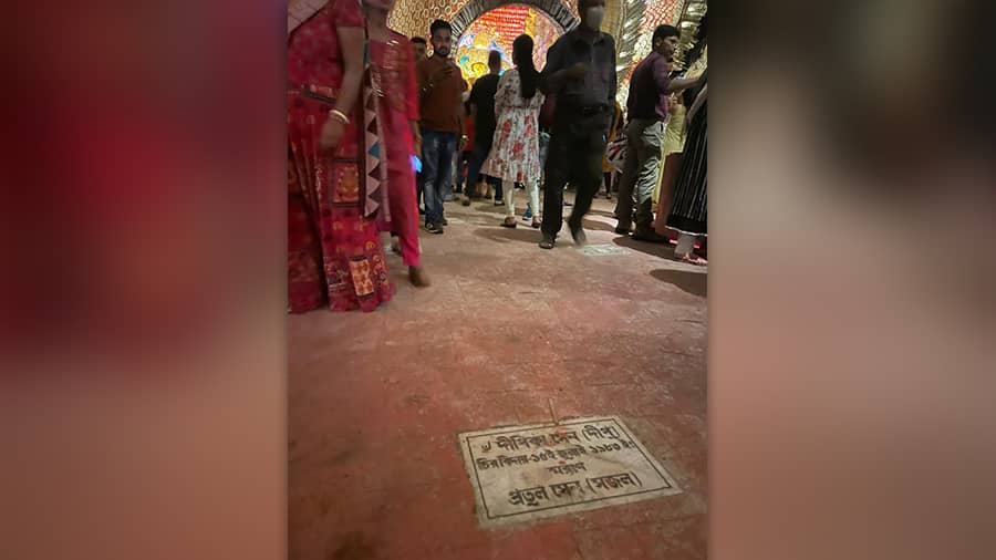
Commemorative plaque: Most would have dismissed the idea of marble plaques on the floor even while attempting to create an authentic mandir feel (“Khoob khaatni”). I saw these embedded and scattered across the floor of this puja across the viewing gallery.

