If art is deeply reflective of one’s emotions, architect and artist Arinjoy Sen’s ‘Bengali Song//The Khudibari Triptych’, an exhibit at the Biennale Architettura 2023 in Venice currently, is imbued with a deep sense of empathy. Arinjoy has collaborated with Malika Dudeja Varma and SHE Kantha for the project. The panels that were digitally printed on silk and then hand embroidered with kantha, touch upon the reality of the times we live in, yet fortified by hope. The intensive kantha embroidery is astonishing in its minuteness. TT chatted with Arinjoy, who is in his late 20s, to learn more.
When did you start work? What was the process like?
I started working on the triptych around late October 2022. The original drawings were commissioned by the Bengali architect Marina Tabassum. She had seen my projects and drawings on the subject of the Sundarbans and its cultural ecology. For the Venice Biennale, I wanted to elaborate these with the beautiful artisanal work of SHE Kantha.The triptych ‘Bengali Song’ imagines planetary survival by prioritising respect between diverse ecologies and people.I started drawing the people and planning the moments where these resilient narratives get expressed. The drawing style has been primarily influenced by patachitra — a traditional method of folk painting used to tell stories and accompany folk theatre performances rooted in Bengal.Following that, it was an intense couple of months of research, drawing and composition. Each of the plants, trees, birds and animals in the triptych all belong to the ecology of the coastal flood plains of Bengal. Every drawn element contributes to the production of each of the compositions and are crucial to the reading of the narratives being told in the triptych.
They were all drawn from scratch on a 2D architectural CAD software called Vectorworks 2D.
What fascinated you about kantha?
I grew up with kantha in Calcutta. It has always been a part of my life, as a type of blanket more than anything else. What fascinated me most about the possible relationship between kantha and my triptych was the fact that both are rooted in Bengali folk traditions. The way I draw is not only influenced by patachitra but also the Bengal School;and I had already started taking inspiration from kantha patterns for my practice. ‘Bengali Song’ gives rise to a hybrid medium combining the folk traditions of Bengali scroll painting — the patachitra — and the traditional method of kantha embroidery.
How did you get to know about Malika’s Kantha Collection?
While I was on a short break in Calcutta, returning from London, I had already completed about half of the triptych drawings. During this time, my goal was to find a collective or NGO that works with women kantha artisans. This objective aligned with Marina Tabassum Architects’ Khudi Bari project, which is the central focus of the triptych. The Khudi Bari project is a not-for-profit initiative aimed at supporting marginalised individuals in the Cox’s Bazar refugee camp and coastal flood plains of Bangladesh. It was crucial for me to collaborate with marginalised artisans and contribute to the revival of this incredible craft through international exposure.During my research on kantha practices in Calcutta, I discovered SHE Kantha, an NGO supported by Malika and Malika’s Kantha Collection.
What were Malika’s inputs like?
As I did not have much technical knowledge on kantha, Malika’s inputs were absolutely crucial. Her experience not only informed some of the compositions, but also the subsequent processes required for the production of the tapestries. I wasn’t aware of the possibilities when using kantha, until I spoke with Malika and that is really when everything slowly started falling into place. From the sizing to the materiality and other technical considerations, Malika’s inputs were crucial in the production of the tapestries.
What was it like collaborating with Malika?
It was an incredible experience and in the true spirit of collaboration. After our first few meetings, we decided that the artisans (Anima, Tapati, Kakoli, Sabina, Ajija and Manjila) should make most of the decisions when it came to the detailed embroidery, colours being used in the kantha work and the extent of detail work. It was a process that was extremely fulfilling. The collaboration felt quite complementary, as both sides and processes were informing each other. It was an absolute pleasure working with Malika and her team.
Can you tell us about the motifs?
Marina Tabassum Architects’ Khudi Bari (‘little house’) project is at the heart of this triptych and as such it represents the optimistic possibility of architecture as an experiential, technical and creative laboratory of the future informed by many forms of knowledge.
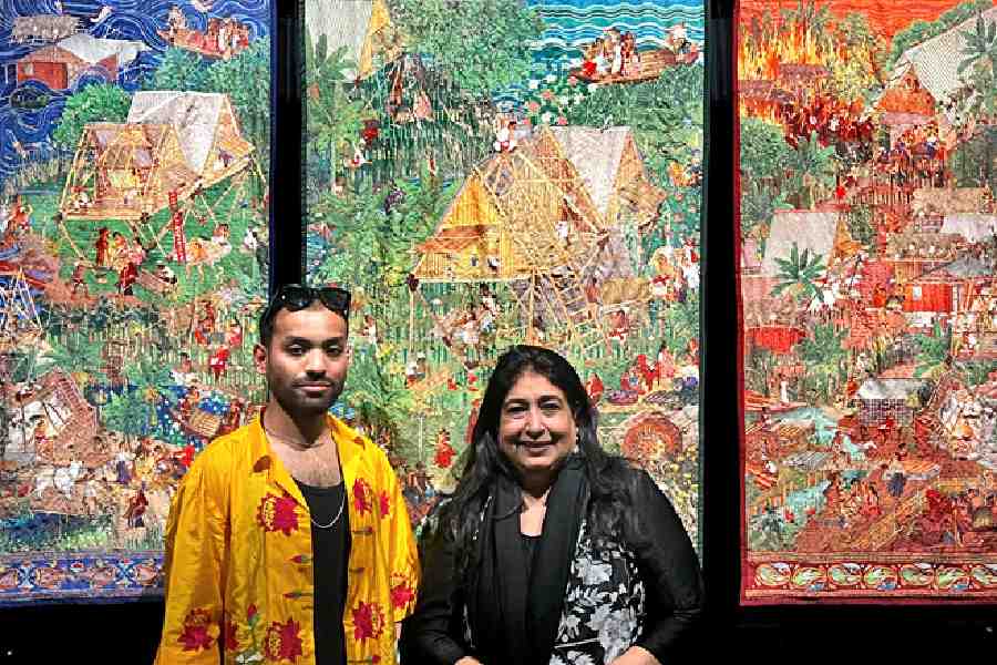
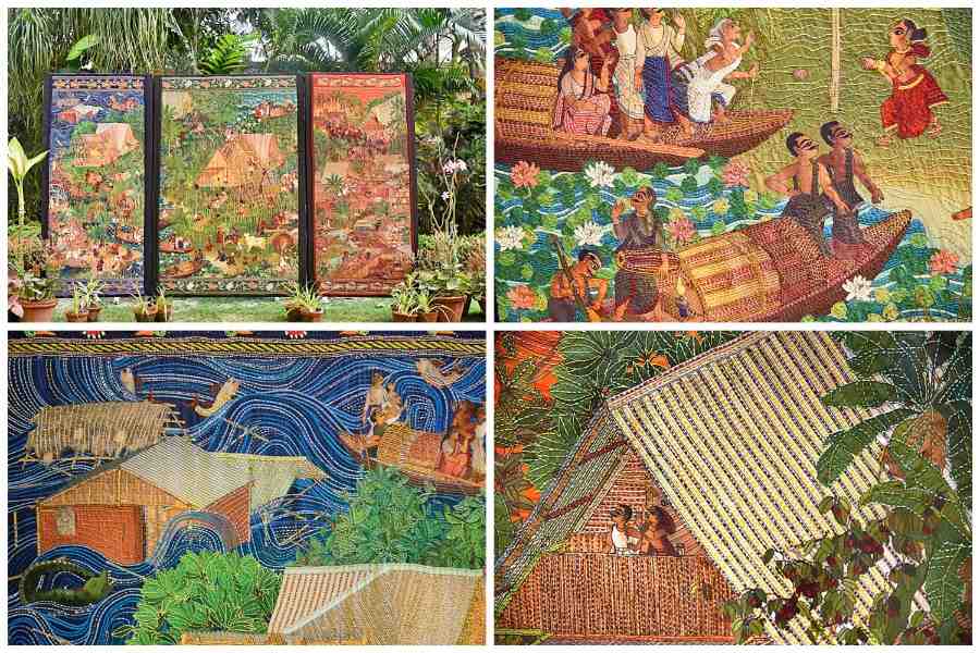
The panel on the left depicts its disposition as a resilient typology within the context of the vulnerable coastal flood plains of Bangladesh. The colour blue is representative of the unruly and unpredictable waters that surround these vulnerable flood plains and the archipelago of the Sundarbans. It is a landscape that can only be understood through the fluidity of the water that surrounds and submerges it.
The Khudi Bari typology elevates the living plane while allowing for quick assembly-disassembly that both enables the user to mitigate the flooding of their household and also allows them to move to higher ground with ease. This landscape has also informed the borders which are woven with fish motifs, which represent one of the primary livelihoods of the people — fishing.The panel on the right shows the deployment of the same typology at Cox’s Bazar Refugee Resettlement Camp. The typology provides a very economical and efficient living space that also satisfies the temporary structural requirements in the refugee camp. The redness of the panel alludes not only to the violence and trauma faced by the Rohingya refugees but also to the urgency of this refugee crisis. It represents the fire that engulfed the land and homes of the refugees, and the fire that lives in their hearts contributing to their resilience in the face of their ethnic cleansing.Finally, the centre panel celebrates the narrative of production, building, enacting and strengthening communal and ecological relationships of deep and mutual respect. It is a panel of hope and celebration represented by the green colour and the lotus motif on the border.
How much time did it take for you to put them together?
The project lasted about five-six months with the production of the kantha taking about three months. On the other hand, I was also working with the curatorial and exhibition team at Venice to design the exhibit where the tapestries will be hung. This took about one-two months of back-and-forth design and planning.
What are you expecting at the Venice biennale?
I am expecting this year’s Biennale to be a very important one, especially in the aspects of diversity and representation. I think this year’s Biennale has a lot of young and diverse participants.
MALIKA DUDEJA VARMA, DIRECTOR, SHE KANTHA AND MALIKA’S KANTHA COLLECTION, HAS BEEN OVERJOYED WITH THE RESPONSE THAT THE WORK HAS GARNERED AND FEELS IT IS A PROUD MOMENT FOR BENGAL AND ALL ITS ARTISANS. HERE’S WHAT SHE TOLD US FROM VENICE:

Arinjoy Sen and Malika Dudeja Varma at Biennale Architettura 2023 in Venice last week
Arinjoy came and met me on December 15. He loved the work we do and had seen it on social media and therefore looked for us. When he saw it up close, he was “mesmerised”. He took a lot of pictures and spoke to mum (kantha revivalist Shamlu Dudeja) and me. We sent him coloured thread charts, just to show him what it was all about.
We met again on December 23. He had ordered little swatches to be printed in Chandigarh. He sent me those swatches to see what work could be done. The material couldn’t have been too thick or thin. He chose the printing swatches to be done on three-four types of fabric. We chose the one which was the easiest for our girls to work upon. He was very keen that everything be done in India. In January, he sent us the work to be done. He had already chosen the borders on his December visit.
He trusted me with my sensibilities and didn’t interfere too much and it was so easy to work with him. At the same time, he was very involved too. He wanted highlights of kantha, but eventually, it was a lot of kantha, much more than he wanted. It was looking so beautiful, we couldn’t stop! (Laughs) There was going to be a lot of shade-on-shade, not too many opposing contrasts because we wanted to have the background also to show. The work is very intricate. We started work with a single layer and to give it the original kantha look, we layered it with muslin. The backing is of a stronger layer, silk.
There were specific instructions on the finishing — the top and the bottom. Also, how they were to be hung. The loops we put in had to be specific. Frankly, I was a little nervous, but the response has been overwhelming. t is a huge achievement for our artisans. We hope to take this further. This was a one-of-a-kind collaboration. When he told us it’s going to go to the Biennale, I almost fell off my chair. The pieces reached the Biennale immediately after Poila Baisakh.
It’s been amazing working with him. He understands kantha and how difficult it has been for us to get it for him. We were on weekly calls and every Friday we would talk and try to update him. The girls were working in their villages and they don’t have smartphones and it was difficult for my supervisors to go into those villages every week.
This is my first time at the Venice biennale, though I have been to Venice before for an LSG trip. It always has had a draw for me. We had gone to a biennale and little did I know that we would be back with the word ‘biennale’ on our CV. The biennale experience is so special. I have to thank my team. They have worked very hard to bring it to the level of perfection that everyone is happy with. I really can’t believe this is happening. I have to thank Arinjoy for this, that he found us and trusted us!
