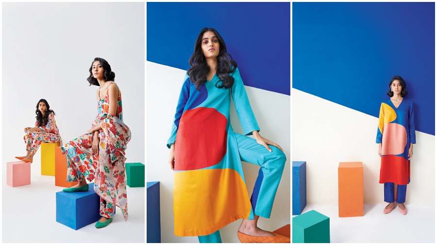
Tradition reinterpreted into contemporary silhouettes. That’s been Kshitij Jalori’s aesthetics ever since he started the brand two-and-half years back. The Ajmer boy who is now based out of Delhi, studied textiles at NIFT (2008). “That’s why all the textiles and techniques, be it the approach to prints or embroidery or the way I weave my fabrics, there is a lot of detail that goes into the textile,” he says. We dialled him to know more about his latest line Kellee, a collection which has the art of Ellsworth Kelly at its core. “All the influences which have formed a part of my work are also influences in and around my life,” says Kshitij, who is “obsessed” with the “tropical motifs” right now. Kellee is easy-breezy and the colours add to the fun. A candid chat.
Kellee is different from what we have seen you get to Calcutta...
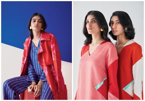
Kellee was in fact supposed to happen last year, but it happens with everything I plan a year ahead taking proper shape a year later. The inspiration behind this collection is this particular American artist called Ellsworth Kelly. If you’ve seen some of Ellsworth Kelly’s artworks, he is literally a modern-day Mark Rothko. In Mark Rothko, you see a lot of colour blocking that is painterly, essentially a lot of tonality in each colour and the roller-brush sort of effect. Kelly does a flat colour. And, geometrics work really well. He would not only imagine geometry and paint them but also take a lot of inspiration from architectural shadows to paint some of the shapes. That became the base for our ARCO series, which has become an inherent part of every collection where I take inspiration from architectural shapes and translate them. It started with art deco-inspired Moulin Rouge, my 2019 Lakme (Fashion Week) collection.
There are two kurtas (in Kellee) which are typically more architectural in nature. Other than that we have done a lot of floral prints.
Especially the one that looks like a colouring book is lovely...
We call that particular print Artbook. There are some shapes that have been filled up in flat colours, which balances the shapes outlined. If you look at Kelly, you will notice there aren’t too many florals. There are one or two outlined leaf shapes that he’s done. Otherwise he hasn’t done anything remotely close to florals. It’s abstract, super modern in terms of shapes. What we imagined was an American artist in a Mexican garden with an absolutely new language of florals. They are far more contemporary compared to the kind of florals I am essentially known for. If it’s in brocade, it is a different quality altogether, but even when I do the prints in florals, they are more painterly. There is a lot of depth and colour tonality. We went minimal here.
Like all your collections, this too is seasonless and global...
When I started the label in 2018-end, the idea behind this whole global set of clothing came from the fact that a lot of international brands when they started coming to India and even today, they use fabrics which are polyester and viscose. We have this wonderful handloom tradition in India, which when I was in college, was largely stuck in the wedding market. The idea was to give this textile a more global appeal. That’s why you see brocade trench coats coming through.
Bread and butter is kurta pants. That’s what I do the most and it also sells the most, but this experiment is going to continue. The pantsuits have done really well and so have the jackets.
What we also love is how neat the designs are...
Minimalism is another important aspect. The way I approach my textiles, there is a lot of detail and there is a lot of character put into every weave and shape. In terms of garment construction, (there is a lot of thought) on how the garment and fabric should feel, lining kaisi honi chahiye and how the stitch lines can be concealed. In most of my winter range, you cannot figure out a single stitch line anywhere. So, a maximalist approach in terms of detailing but when it comes to the silhouette form as such, there is a very minimal approach because you have emphasised so much on the beauty of the textile you are creating that you give it a straight, simple silhouette.
Do you draw yourself?
Yes. In fact, I am a fine arts student.... I used to paint back in school. I have done my education from Mayo (College; Ajmer) and one of the reasons my father had put me there was because there was a strong arts department. My art teacher who helped me develop my skills is a Bengali, Ashok Hazra. He taught me all mediums, be it oil or water or poster.
Tell us about your personal art collections...
I do have a lot of antiques, be it small objects or a lot of textiles. I developed this habit in college and I have a small library of 200-odd textile books which obviously become reference points.
Whose works would you love to collect?
Henri Rousseau. In Saigon Central (fall/winter 2021) there is a print called Malagasy that is a tropical take on how Henri Rousseau would have painted a tropical artwork. Another artist we have tried to incorporate in Saigon Central is Henri Matisse. He had a linear, abstract but expressionist sort of take. In India, we have Jamini Roy who I really like... very interesting use of striking lines and colours.
What are some of your favourites in textiles?
There are many... I like the Chamba Rumals. The inspirations are largely Krishna and Gopi stories, but there are other stories also that they embroider. Of course we have the chikankari and pashmina. I have developed pashmina brocades. Phulkari is another craft that I am looking at. I wanted to incorporate Pipli as part of Kellee. It would have blended really well.
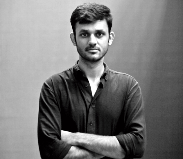
We have a maximalist approach in terms of detailing but when it comes to the silhouette form as such, there is a very minimal approach because you have emphasised so much on the beauty of the textile you are creating that you give it a straight, simple silhouette —Kshitij Jalori

