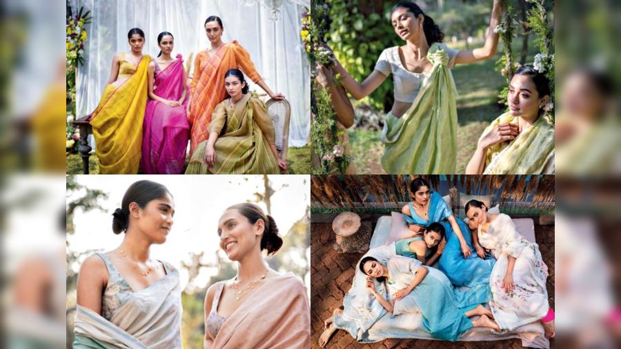
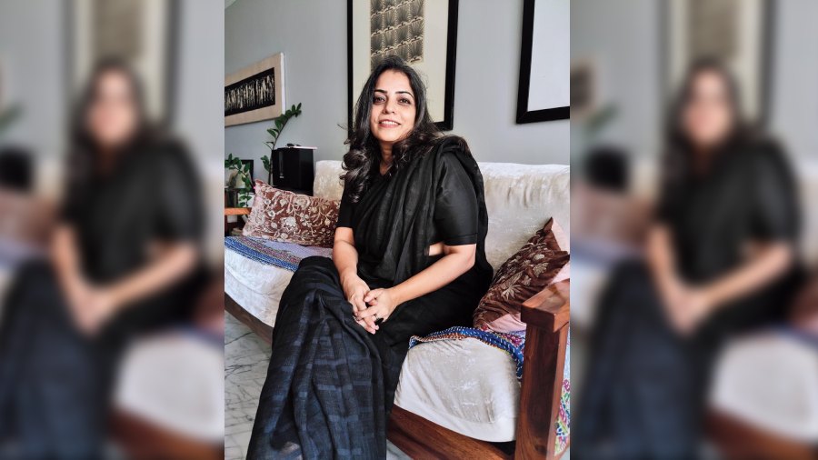
Much has been talked about the valley of flowers in the north but in the lap of Maharashtra lies the Kaas plateau that is a beautiful kaleidoscope of colours right after monsoon renders its volcanic soil sufficient for nurturing life. Designer Anavila Misra’s Kaas collection of summer staples borrows from this smorgasbord of colours, flowers and beauty to create her signature range of apparel that, in her own words, is both a “continuity” of her design vocabulary as well as the addition of new elements — a lot like spring itself. While soft pastels form the broad spectrum of this collection, one might also catch glimmers of sheen — much like the actual Kaas skies when streaks of the summer sun shine bright. Organza saris, khadi dupattas, silk, satin and zari, stripes, checks and ombres find place in Anavila’s new collection. In The Telegraph chat, she tells us more:
How did you get introduced to Maharashtra’s Kaas plateau that inspired this collection?
I have been living in Mumbai for the last 14 years and during my travels to the different parts of Maharashtra on weekends and holidays, Kaas was one such place that I visited two years ago. It is phenomenal right after the monsoon as the whole plateau completely transforms to a natural heaven. What we have heard about the valley of flowers in the northern hills is so popular but Kaas is no different and is beautiful! There are certain varieties of flowers and plants that you don’t even find anywhere else because of its unique habitat of being a volcanic layer of soil. After the rain, the soil supports those flowers. There is so much biodiversity that there are a lot of butterflies and birds that become a part of that whole seasonal transformation of that place. I had heard a lot about this place from my friends and I also wanted to shoot there once. Now that it is slowly getting popular, there are restrictions about the number of people and the activities so that the place is not endangered. When I was thinking about spring and flowers, this place came to my mind. It’s so beautiful!
How do you tie up the collection with Kaas?
If you see, there are not many florals in this collection — there are just one set of kurtas and two saris. But the whole hue of colours that has been created is inspired by the Kaas landscape, where the sky is blue and beautiful just after the rain and the flowers bloom in groups of yellow, purple and peaches. There are a lot of orchids and a lot of unkempt wild flowers also and so a variety of unusual colours can be seen there. There are a lot of colour palettes, patterns and textures there and hence, you see beautiful purples, hues of yellows and peaches that can be seen in this collection.

What kind of fabrics and design elements have you used in this collection? What can the metallic sheen in some of the designs be attributed to?
How you see the streaks of sun in the sky when it’s very bright is what inspired the metallic sheen. The blue that we have done is very fresh and beautiful. The streaks of jamdani are straight geometric patterns rather than a motif. There is a large amount of linen in the saris but for the plush surface texture of the flowers, we have used a lot of satin. We have done Nova sets in satin. Then there are organza and cotton stripes in bright fuchsia and yellow, green — in the same colours but different hues, like the clusters of flowers at Kaas. The zari you are talking about is actually a silk warp with a zari weft that gives it a subtle and beautiful sheen.
The blouses in the campaign images look very pretty with subtle textures and motifs…
If you look at the ombre saris, it is the same play of colours — dark to light and the blues in different hues. The organza and the ombre saris have the same colour-play. I did not want to do a complete print but I wanted to do a complete feel of that colour and how it goes from deep to light, with a few flowers that come on the blouse — like it’s on the actual landscape. It was a very conscious decision to not make flowers that ran all over.
Your campaign shoots are always very visually soothing and blend well with your design moodboard. What were you going for this time?
There are five models we have worked with. Nature, when blooming, has a very youthful feel to it and that’s what we wanted to portray through the campaign as well. The make-up is minimal but we have used colour. It is youthful, rosy, about spending time outside and being your own, even in the company of others. It is about having a nice time and enjoying the company of spring. Youthfulness is the undercurrent running through the campaign because that is the feeling that spring brings. It is about new beginnings.

Since you are known for your signature styles in linen, how challenging is it to keep evolving your design vocabulary within your distinct set of aesthetics for your loyalists?
What you said is right that there is a particular look to our designs — for example, the Nova sets, the garden shirts and some of the handwoven textiles we work with for our saris. But it keeps us on our feet. The same set of weavers and same set of yarns teach us how to keep thinking out of the box. Eighty per cent of our clients are repeat clients so we have to see what they already have from us and what new things we can offer to them. It makes us think from the perspective of our customers and how they would want to pick a new piece from us that would blend with what they have. So there is always an element of continuity from one season to another and are not completely independent of each other. Somebody who has bought a nova set from an earlier season can buy a dupatta from the new collection and still feel like they have something new. But we also try to rephrase with new fabric developments, new prints and new textures.
Pictures: Courtesy of designer


