While Portnoy’s Complaint is possibly Philip Roth’s most in(famous) book that got him critical success, it also started his tryst with the typeface Caslon and its variants for most of his book covers, if not all. The book in question, designed by the iconic Paul Bacon, also catapulted Roth to the category of “important” writers and led to Bacon’s style being typified as the “Big Book Look”.
And during a subsequent interview with design portal Print, Bacon had credited the lack of imagery on the cover in question to his inability to portray the book’s most prominent imagery of masturbation. But what the “Big Book Look” on the cover did was to create a no-nonsense appeal for its content that would reel in readers at first glance. Since then, it bas been a ploy well used, most recently by Emily Ratajkowski in My Body, when she consciously opted for a text-only cover sans an image in order to deflect attention from “her body” — the subject of discourse in her book.
Ideation to fruition
The book cover, therefore, is as integral to a book as its story. Most writers, like Karuna Ezara Parikh, are able to have an idea about their cover, before they have finished writing the book. Parikh, who recently released the paperback version of her debut novel The Heart Asks Pleasure First (Pan Macmillan India), used her idea of the cover as a catalyst to finish writing.
“It helped me visualise the final piece and spurred me on to turn it into a reality. When you’re writing, you often wonder if your work will ever be published, and this was one way to keep that hope alive,” she explained. For the hardbound version of her novel, Parikh had Shilo Shiv Suleman and Semy Haitenlo bring Suleman’s painting of dancer Reshma Gajjar to life on her cover, while Rhea Gupte created the paperback with an assortment of objects that were tied to the story.
Gupte, who has also designed the cover of Parikh’s book of poems titled Where Stories Gather (HarperCollins India), says: “Both Karuna and I knew we wanted the hardback and paperback covers to be like sisters, belonging to the same family, yet with their own unique identity. The process of this book started with the story Karuna has beautifully woven, then a rough concept sketch and then, the colour palette, which we all agreed on. It took a while for me to source all the specific objects I wanted on the cover. Several elements were hand-painted, photographed separately and then composed digitally in how I wanted it to come together.”
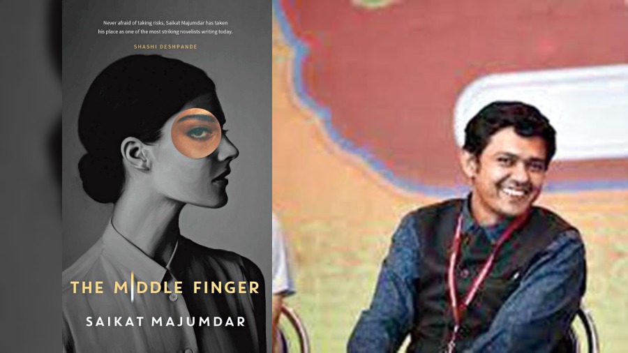
Pinaki De has been designing book covers for the last 15 years and has worked on over 500 covers, including The Middle Finger by Saikat Majumdar, more recently
Semiotics of the system
Coming back to Roth and his “Big Book Look” of the boys’ club of 70s writers in America, there are also certain stereotypes associated with the straitjacketed approach towards making book-cover art.
“I knew what I didn’t want; I knew I didn’t want a book cover that straightaway signals that it’s a book about women written by a woman,” says journalist and writer Anindita Ghose, whose debut novel The Illuminated (HarperCollins India) released last year. “There are certain tropes in book cover design for what are considered ‘women’s books’ if you notice — the female body, flowers, jewellery, pleasing colours.
“I studied semiotics in college and the journalist in me also researched these often-used colour schemes and typefaces. I didn’t want my book to be read only by women. I didn’t want it to visually appeal to 25-year-old girls only. I didn’t want my book cover to look gendered. Why shouldn’t my cover look like a Philip Roth or a Jonathan Franzen cover?”
Her cover, designed by Bonita Vaz-Shimray, has the title of the novel and her name on a black background with shapes of the moon in grey, white, silver and gold.
The cover was a product of multiple conversations and iterations between the design team, publishers and the writer herself. The metaphor of the moon that runs through the book has found a place of prominence on the cover and ties into the story neatly.
About designing the cover, Vaz-Shimray says: “Conversations with Anindita were very constructive as she would keenly look for references that demonstrated her ideas and aesthetic. Although an eclectic mix, the metaphor of moon phases was what we took forward and the moons depicted as slightly indirect undulating circles, inspired by mid-century geometric patterns. Also, the font chosen was gentle yet visible. Most importantly, the production of the book is where the concept culminates — the die-cut on the dust jacket reveals the representation of the two central characters, Shashi and Tara, along with the other female characters who form the third moon on the layer below.”
Ghose’s book is awaiting its UK release with Head of Zeus in 2023 and has a new cover for it, which has been designed by Holly Ovenden. “It has moved away from stark black and white to the colours of the sunset. The moon motif has been carried forward but with a slightly exotic crescent shape in gold foil. They understand what works in their market better and I do think that the UK cover complements the Indian one,” added Ghose, who will also have the paperback version of her book release in India soon.
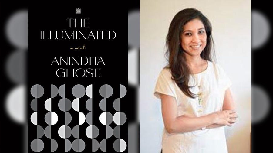
Bonita Vaz-Shimray of HarperCollins India designed the cover for Anindita Ghose’s debut novel, The Illuminated , which was released last year
A multiformat, technical approach
Evidently, the art of designing book covers cannot merely be left to pleasing aesthetics as the devil is in the detail — and the technicalities involved. For example, as Ghose pointed out, she had to keep in mind the fact that she was a “pandemic author”. This, essentially, meant that the marketing of the book would be digital and that most people would be introduced to it through images on social media. While the pleasure of reading books lies in the very tactile process of picking one up, the fact that #Bookstagram feeds that pleasure cannot be disregarded.
Ghose explains: “It was my editor who made a case for a short title... a long title would eat up space, reduce the space available for my name and be unclear in digital thumbnails. So while making a final choice in this age of social media, we had to consider which design would be appealing on both digital platforms and bookshelves.”
There are other elements that also play a pivotal role in designing book covers. “Basic information like genre, positioning and competition are critical in determining the approach.” says Vaz-Shimray. “Not all covers follow a linear process but typically, the art is one aspect of the cover that is an outcome of the concept. Once you have that in place, you look for the right photograph or artwork or commission one if needed.”
For Pinaki De, who has been designing covers for over 15 years, the approach has changed since it now involves a multiformat endeavour. “Everybody is not just seeing images of these books but also reading them on various devices. The cover has to seduce a reader through both a screen and a corner of the bookstore. It’s not just about the cover being attractive anymore but also acting as a sub-text for the book to reel in multi-format readers,” says De, who has designed over 500 book covers till now, including The Middle Finger (Simon & Schuster India) by Saikat Majumdar, most recently.
From the publisher’s perspective, the approach also varies depending on the book itself. Sayantan Ghosh, senior commissioning editor, Simon & Schuster India, says: “Once the edits are done is when the editor of the manuscript and the writer start discussing what the book is turning out to be and the cover is commissioned. For a biography that I published last year (Guru Dutt: An Unfinished Story by Yasser Usman), I knew early on that a picture of Guru Dutt would go on the cover. We picked out a few images and set out to see what would fit. For all books, when the ideas are finalised, it’s a joint decision by many, including the sales and marketing teams.”
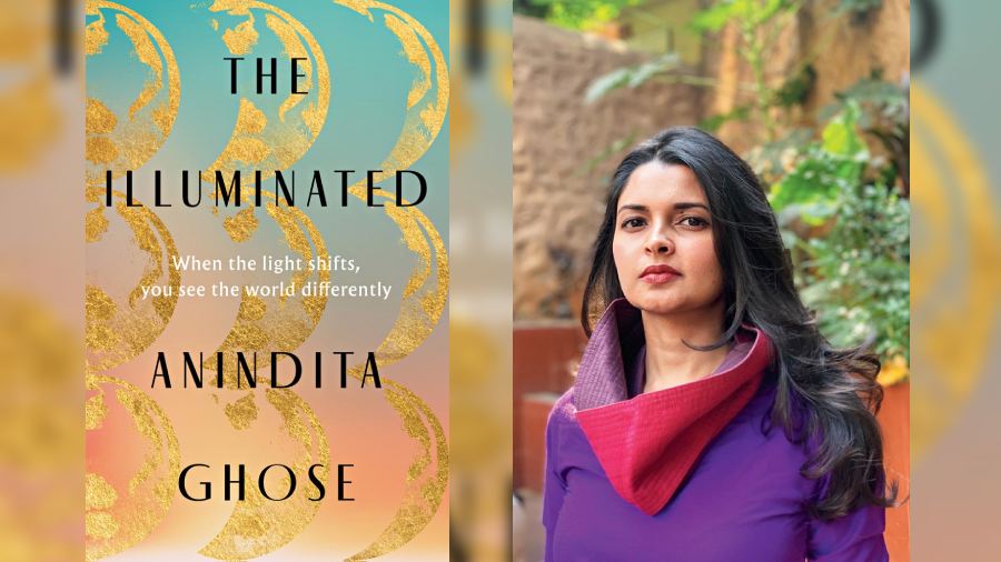
The UK cover of Anindita Ghose’s novel, which is set for a 2023 release
Art and the artist
Talking about reeling in readers effectively through strong cover art, it would be erroneous to not mention Satyajit Ray, whose prowess in designing book covers is only overshadowed by his own genius in other artistic fields. For perspective, in order to truly translate the heroics of Jim Corbett, who killed a tiger from such close quarters that his bullet pierced through its gut and came out from the other end, he imagined the skin of the animal laid out horizontally with the double perforations in his cover for the Bengali translation of Man-eaters of Kumaon.
This and over 70 such covers had gone on display at the India International Centre in Delhi for an exhibition a few months ago. And it is of no surprise when De referred to Ray as the most important artist when it comes to cover art in India. However, developing one’s signature style in the business of creating book covers might be tricky terrain to manoeuvre for all.
“The cover is an extension of the story and how I approach it is by removing myself from it. The writer has written the book, the editor has edited it and the marketing team will market it. You design the cover. So you cannot give yourself too much importance here,” said De candidly.
On the other hand, there are also artists — like Gupte for instance — who are known for their signature style, which writers seek them out for and the cover is the result of a serendipitous collaboration between all the stakeholders. Sometimes, as Ghosh pointed out, editors also get in touch with artists if their art portfolio on social media looks appealing — and therefore compatible — for a book that they might be working on.
As Parikh put it: “Book covers are art and tell stories from within the story. The challenge is always: Are we going to be in sync? You can use a thousand words to describe what you want and still two artists will come up with two completely different interpretations from a brief. It’s a miracle to find people who [not only] understand but also better your vision. I’ve been lucky to experience that. I also find that my publishers have been most generous to my vision as well.”

Karuna Ezara Parikh’s poetry book cover was also designed by Rhea Gupta Picture courtesy: Upahar Biswas
Rewards and recognition
While the international publishing industry has more recognition for book-cover artists, their names often get lost in the fine print in India. However, the Oxford Bookstore Book Cover Prize that was instituted in 2015 is a first-of-its-kind award in India for book-cover design and both De and Vaz-Shimray have been winners.
“The prestigious prize appreciates the importance of the balance of graphics and narrative, particularly in our increasingly visual age, and believes that a book cover interprets and decodes the ensuing text in crucial ways that contribute to its ultimate success,” said Maina Bhagat, director, Oxford Bookstores. “I believe this is much needed to encourage the publishing industry and celebrate the business of books. Because standout cover design is an integral part of the success of a book, designers and illustrators play a vital role in enabling a book to become emblematic and create recall,” she added.
Meanwhile, social media has been acting as an equaliser when it comes to this niche industry within publishing, with most book-cover artists now choosing to work as freelancers and using their online presence to reach out to writers, readers and publishers alike.
Nowadays, the wily #Bookstagram is often accompanied by more hashtags such as #BookDesign and #CoverArt, with many book/book-club accounts also throwing in a line about the cover. After all, the cover is the reader’s first encounter with a story when they pick up a book — and also the final one, when they finish it and turn it around for that one last look.
Pictures: Sourced from writers and their publishers

